Virch Merch
Virch Merch is an online merchandise purchasing platform, that allows fans to buy their favorite artist's gear without ever waiting in line, instead purchasing from the artist's Virch Merch page and allowing talent to tailor their merchandise orders to the number of preorders.
Timeline ⏰
8 weeks
ROLE 👥
UX Designer | UI Designer | UX Researcher
UX Designer
UI Designer
UX Researcher
Tools 🧰
Figma | Slack | Miro
Figma
Slack
Google Meets

Impact
Redesigning Virch Merch’s previous platform allowed for a stronger brand presence that caught both potential investor and client attention. Virch Merch has since grown from its minimum viable product to having fulfillment centers for merchandise all across the continental US, including 1-day ground delivery to over 60% of the country, and has increased client revenue by over 200% on average.
Problem
When it comes to live concerts, selling merchandise can pose a challenge to musicians who find themselves over or underspending on items that don't sell to their expectations, leading to lost revenue. Virch Merch aims to mitigate artist losses and give customers a more streamlined experience, but the current website didn’t have the full functionality they were promising: allowing fans to buy merchandise during shows, and artists to set up their shops. They also needed to cater to the concert scene as a whole, by presenting themselves with a more exciting and groundbreaking brand identity.
Solution
We needed to redesign their existing website and expand on it to include:
Designs for three different flows for the main users: the artists, the fans, and VM’s team as the administrator for artists
A refreshed brand identity that would resonate with concert goers


Discovery 🔬
Discovery 🔬
Understanding Virch Merch's Needs
Virch Merch sent our team an MVP consisting of two developing style guides to get a sense of the vibe their product would have: modern and hip, without sacrificing accessibility. They also provided us with more insight into the vision they wanted for their platform and answered a questionnaire we had compiled for them. Here are the key points of their responses:
The client would describe their product as disrupting, modernizing, and seamless
The four most important deliverables our team needed to focus on were research, branding, the style guide, design assets, and wireframes
The merchandise would only be available for the fans for 24 hours before/until midnight of the day of the concert
Virch Merch's target audience is Gen-Z/Millennial concert-goers
Artists must be able to customize their merchandise shop that fans see
Below is Virch Merch's original website and style guides. This iteration lacked key elements, like a CTA for the landing page, the ability to create an account as either an artist or a fan, and a brand identity that fit the vision Virch Merch had:
Original Screens


Original Style Guides
Exploring Different Sites With A Competitive Analysis
After getting additional context from our client, it was time to move on to competitive analysis to determine how Virch Merch compared to similar services. Many similar e-commerce websites would only be practical to browse at home, after or before the event. Virch Merch stands out as being an online platform built for fans to buy concert merchandise while at the event, so the same metrics for success competitors had would not entirely apply. Because of its unique concept, however, studying these platforms was crucial to ensure we designed while keeping in line with market familiarity. This would allow new users to easily jump in from another site and get to know Virch Merch's system.
Here's what we learned:
Competitors typically had a limited color palette, consisting of neutrals and a minimally used but bold accent color
Store items typically were presented in a digestible grid format, usually about 4 in a row with no fluff or clutter. Virch Merch needed to emulate this simplicity to increase artist merchandise sales
All additional service were clearly labeled. Virch Merch is a fan and artist tool, so it's important that both are highlighted

Amazon
Merch Now
Merchbar
Bravado
Mission Statement
Amazon is guided by four principles: customer obsession rather than competitor focus, passion for invention, commitment to operational excellence, and long-term thinking. We strive to be Earth’s most customer-centric company, Earth’s best employer, and Earth’s safest place to work.
We are a music merchandising webstore carrying everything from t-shirts to CD's, sweatshirts to vinyl, hats, posters and much more from all of your favorite Rock, Punk, Metal, Hardcore and Indie bands and clothing companies.
I founded Merchbar to give fans one place to discover and buy merch from all their favorite bands. A place that is a joy to shop, magically matches you with merch from bands you love and provides an unrivaled shopping, purchase and return experience so you can buy with confidence.
Bravado lives at the crossroads of music and fashion. We understand the power of smart merchandising, and we know how to create products that spark organic, emotional connections between fans and artists.Bravado is about building brands and legacies that live on, beyond the music.
Color Use
Primary colors on top navigation bars, content and cards white fill
Minimal shades of grey, black and white with a bold red accent used sparingly
Mostly black and white, but has some light blue as well. Minimal color added, but to pinpoint cta’s.
Black & Cream//Pop & Modern Punk Rock Style
Strengths
Delivery information provided under each item, search bar is highlighted on each page, emphasizing customer preference, clearly visible status indicators
Very straight forward, modern design. Ability to ‘quick view’ an item to learn more without being taken to a separate page, limited but effective color palette, slideshow of featured artists, link to shop merch or learn more about artist/stream their work
Lots of selections for users to choose from
Clean & simple style to make for easy navigation through website
Culture embraced style/branding
Color choices and minimal information direct users to most important info.
No unnecessary content, everything has a purpose
Weaknesses
not focused on merch, specifically
extremely high volume of information on each page
Artists have no involvement in the process
Text is not always AA compliant on sliding banner images
No way to navigate the highlighted artist carousel
Item borders are defined by space alone, not effective depending on what is next to what
website seems to feel cramped, lots of information for the user at once
Main Slider/Carousel compressed & low quality
Initial confusion on what they do
Hard to tell which artist/apparel they’ve created with linking to every artist store
News page is cluttered
No examples of services offered
Easy-to-Schedule services
Navigation
Clear description of services
User Stories
We were provided with ten user stories from the client:
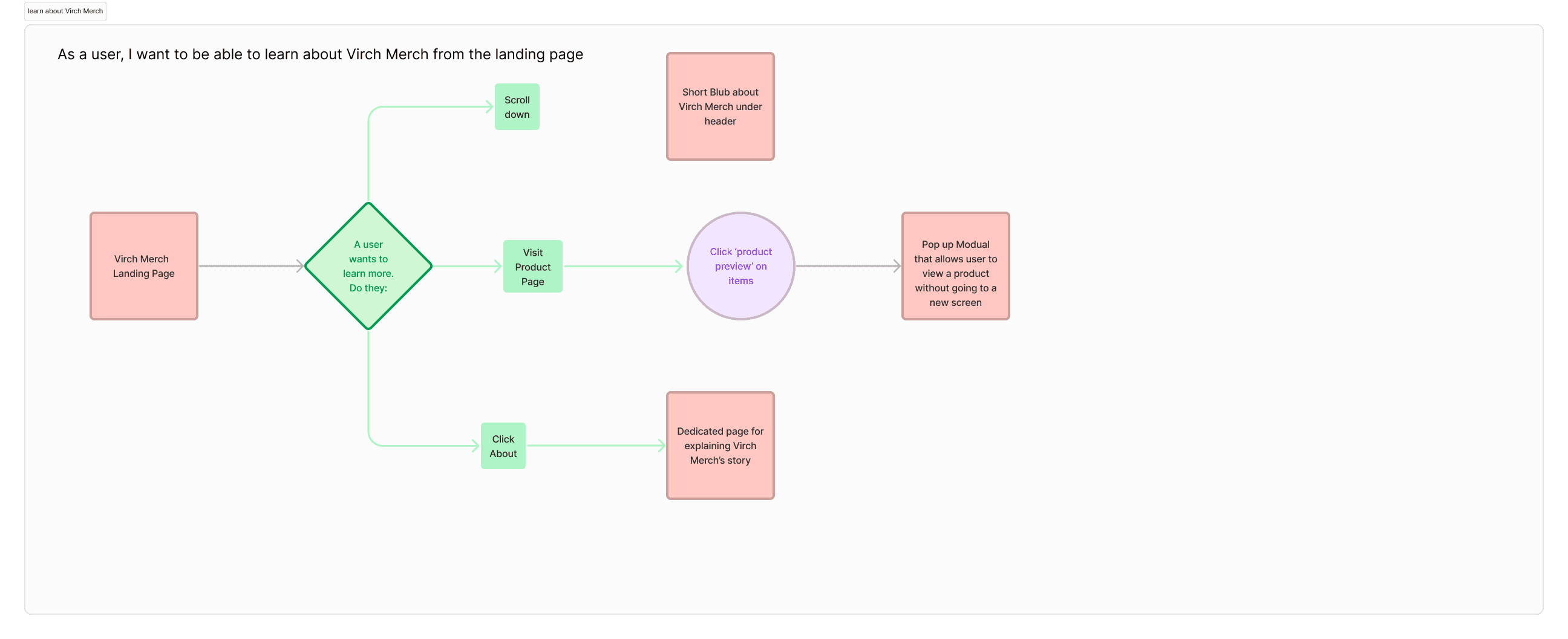
As a user, I want to be able to learn about Virch Merch from the landing page
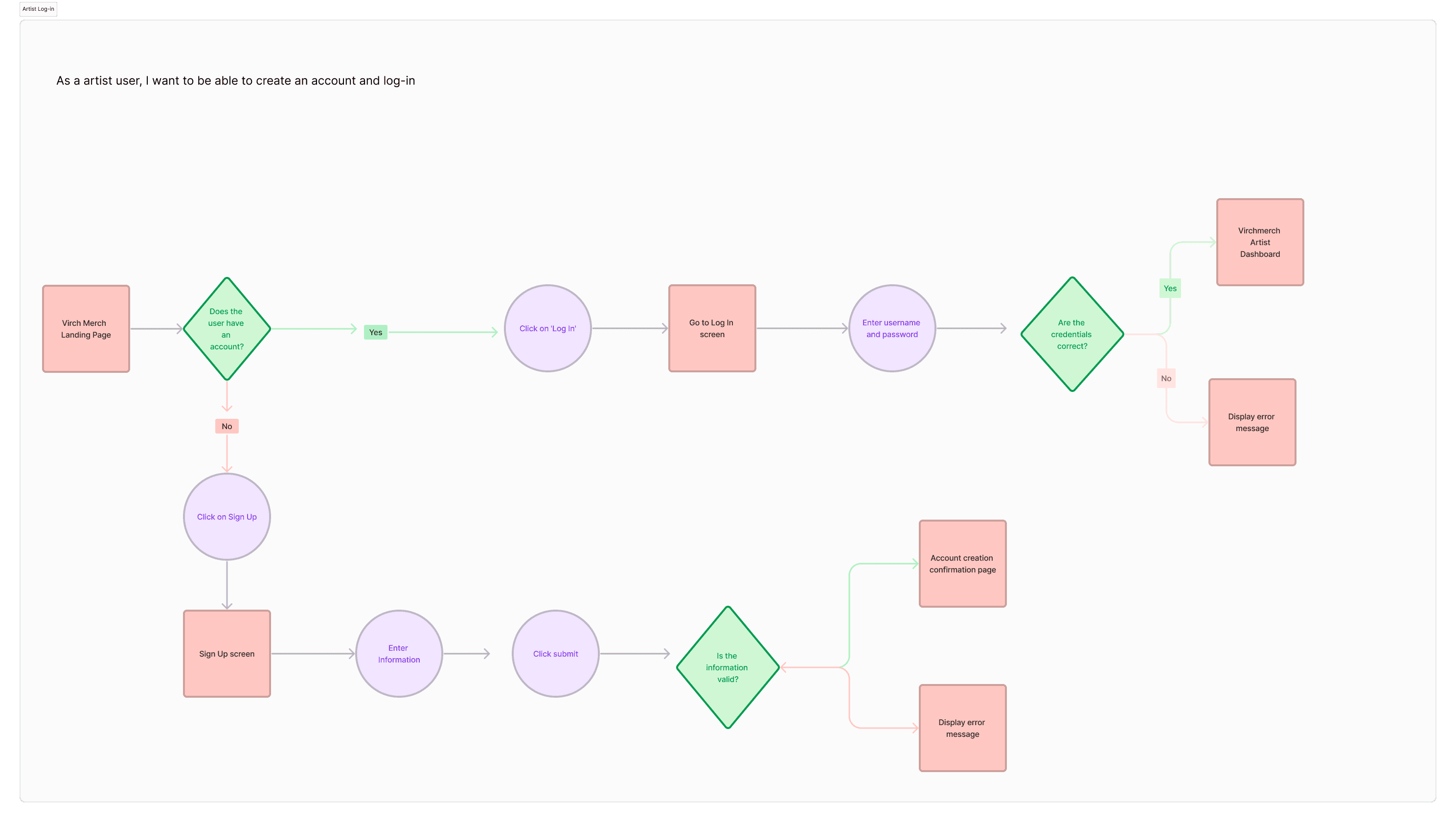
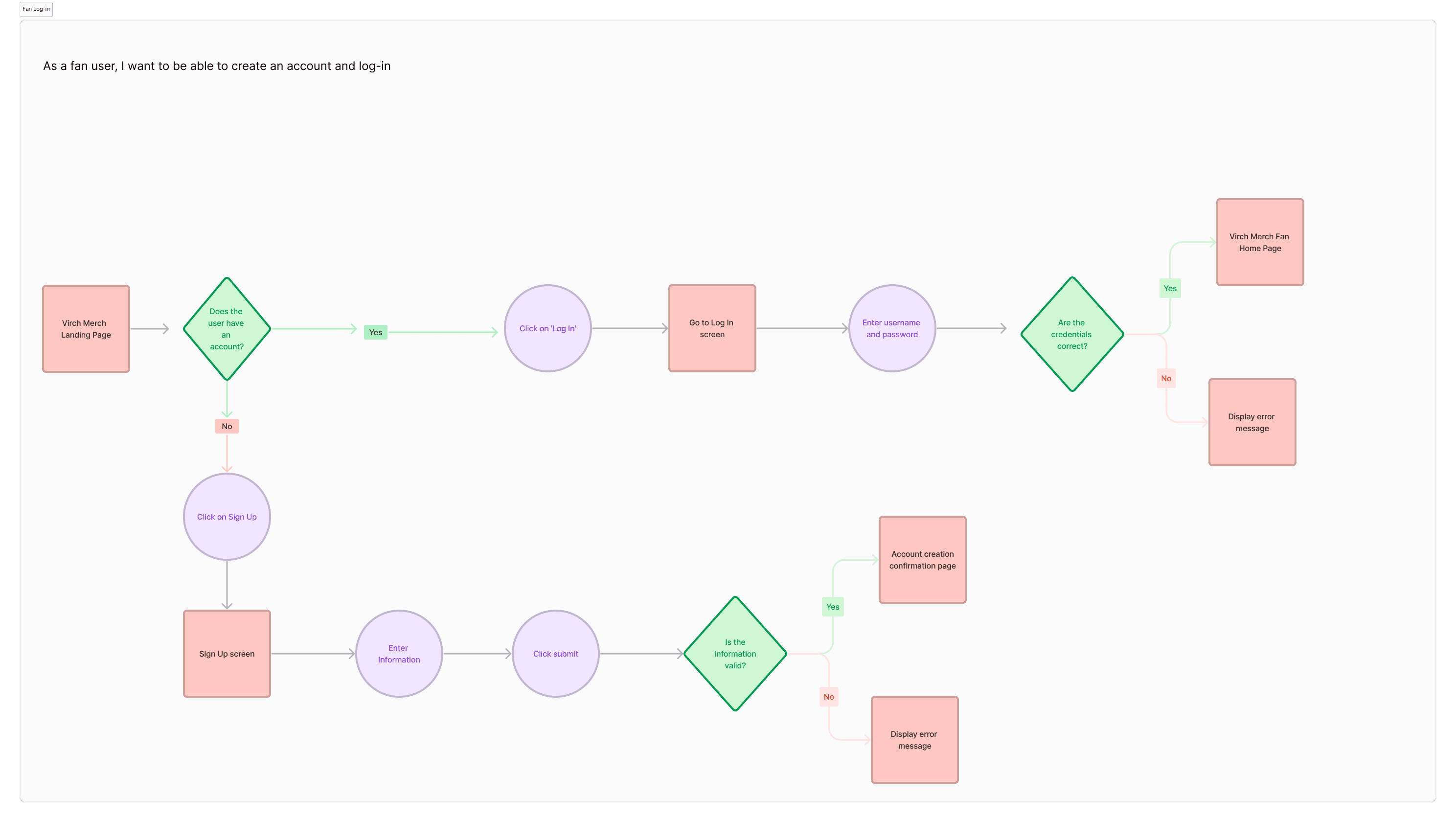
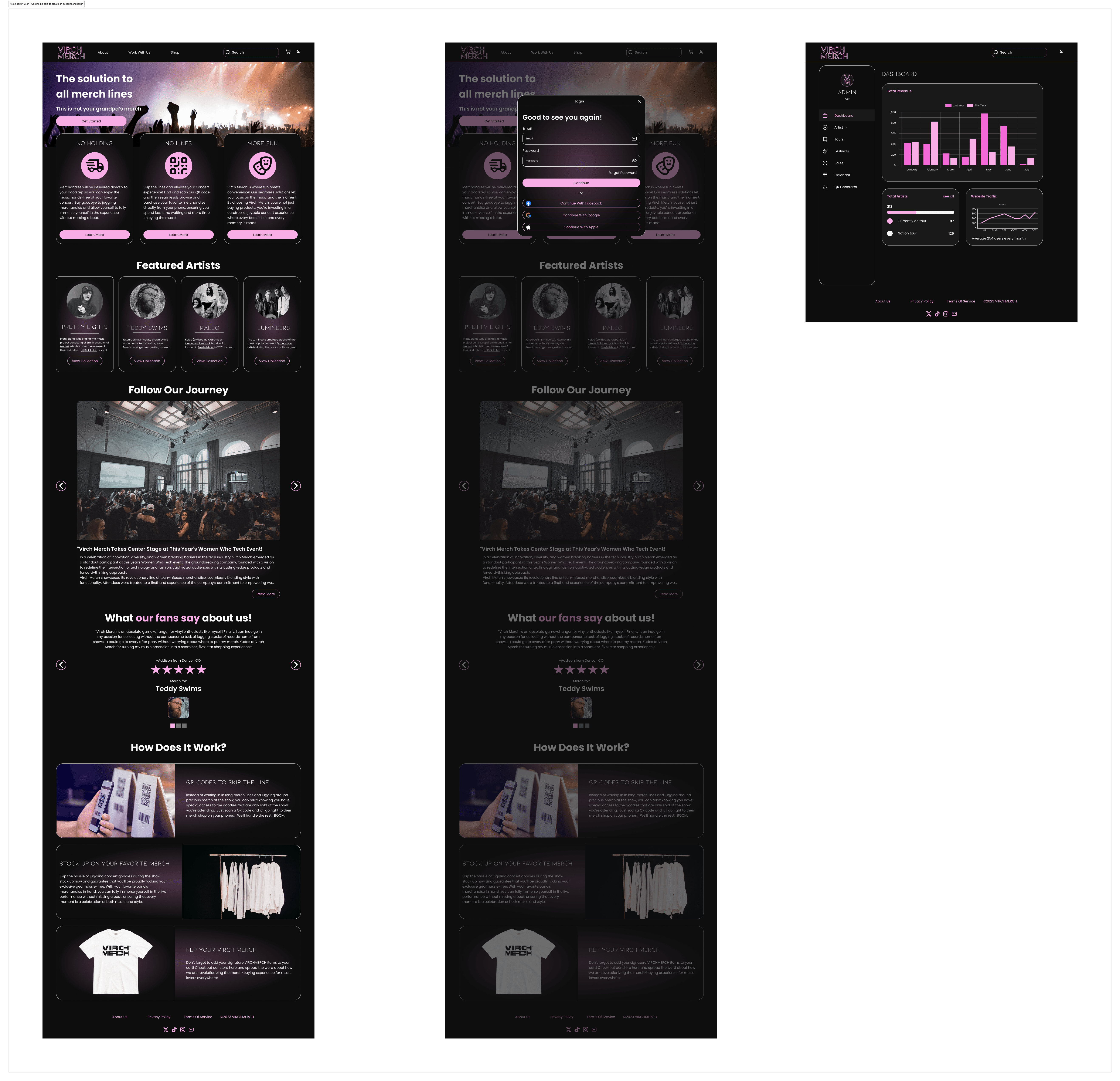
As a fan user, I want to be able to create an account and log in
As an artist user, I want to be able to create an account and log in
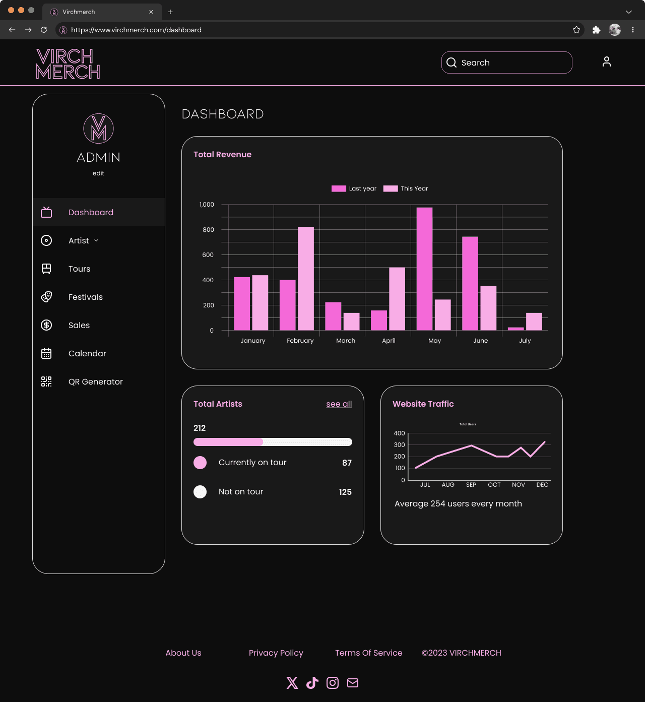
As an admin user, I want to be able to create an account and log in
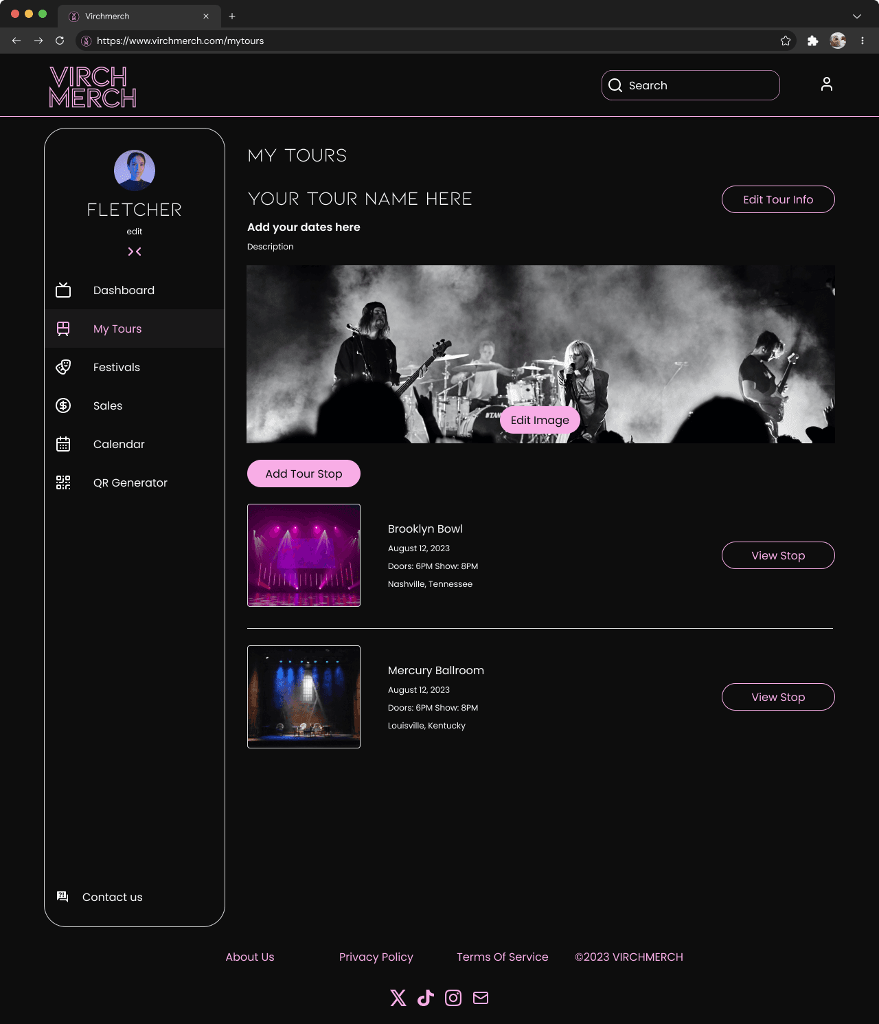
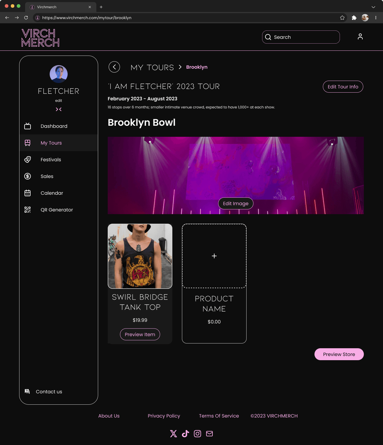
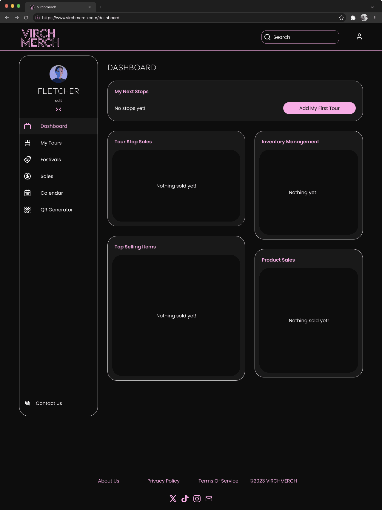
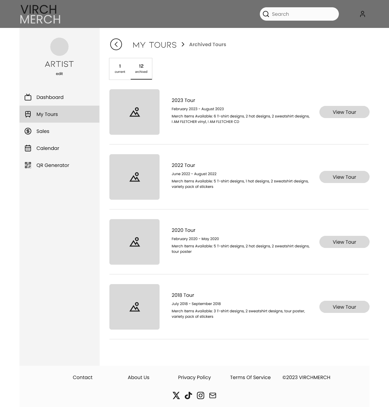
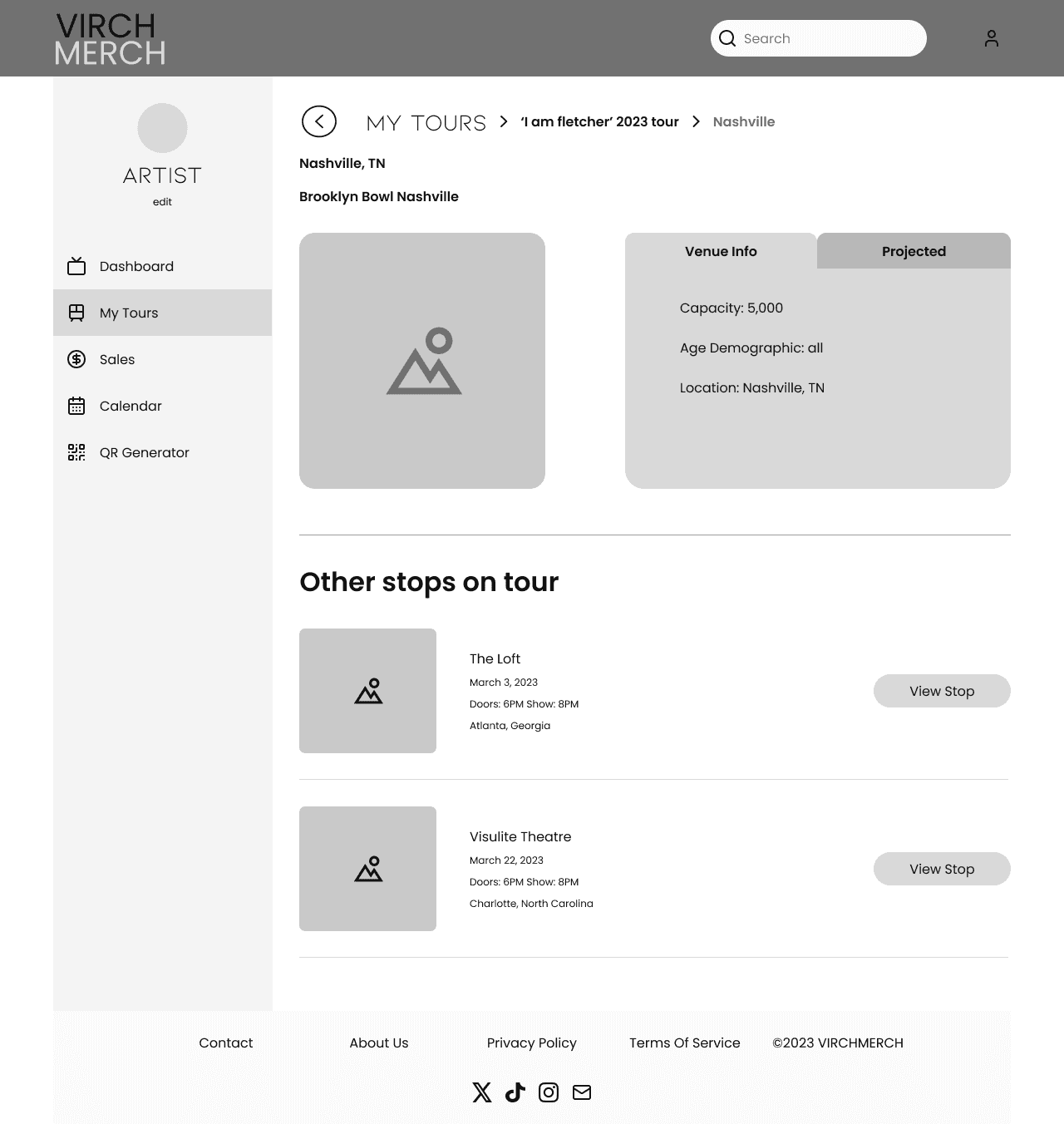
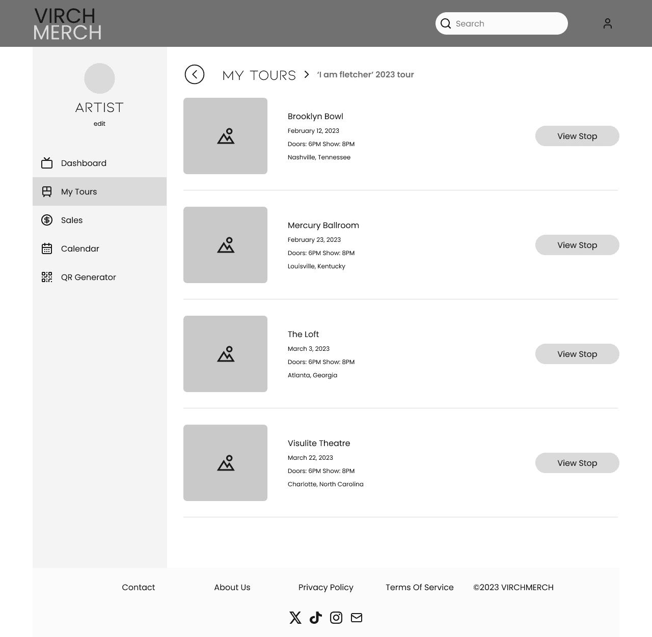
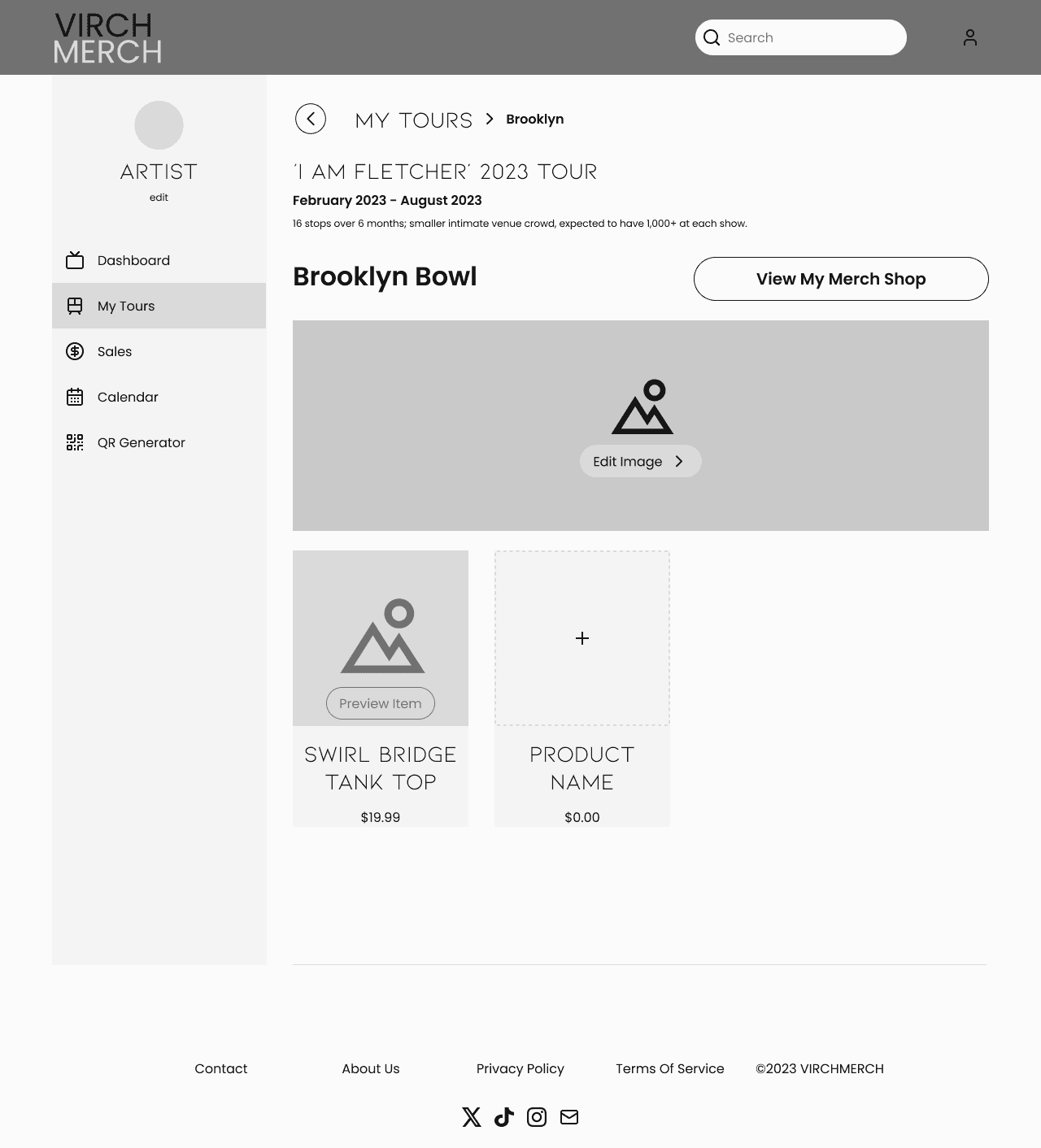
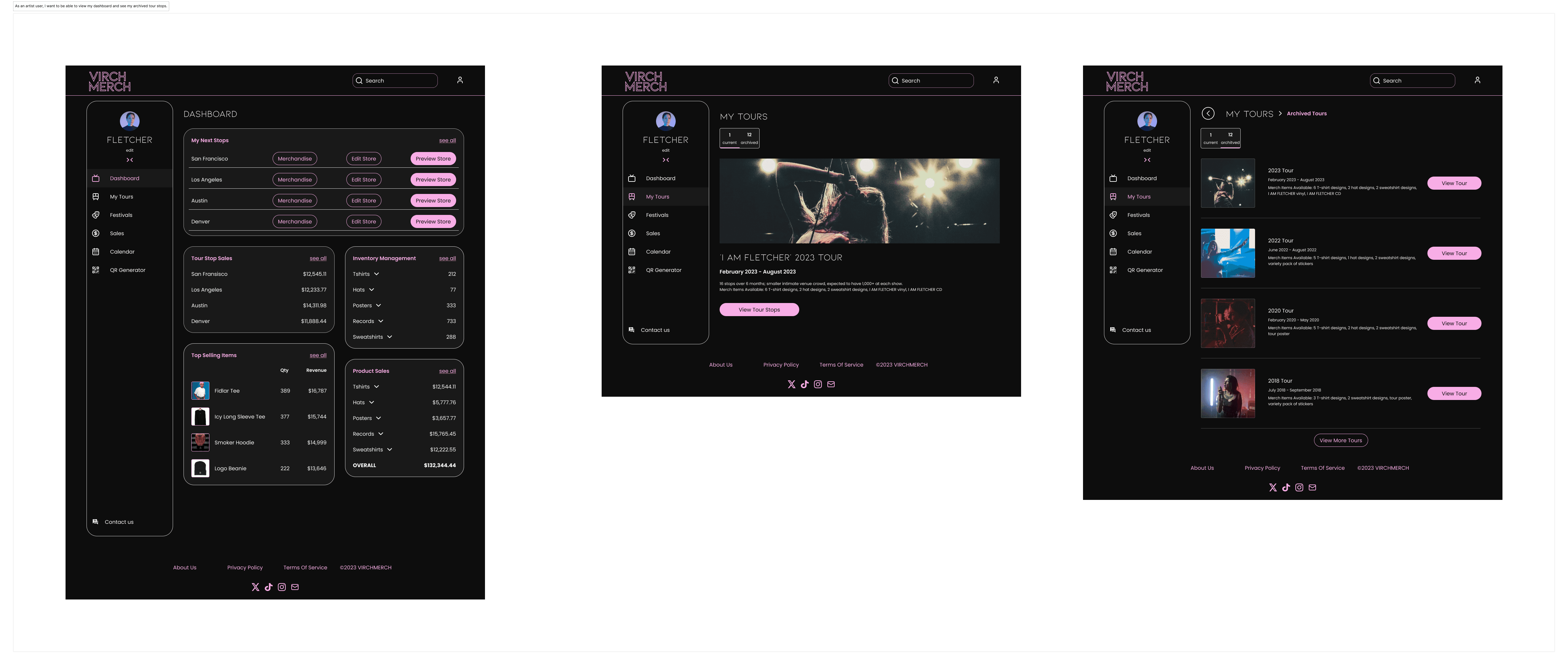
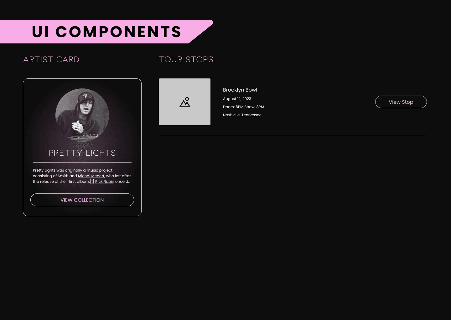
As an artist user, I want to be able to view my dashboard and see my tour stops
As an artist user, I want to see my archived tour stops.
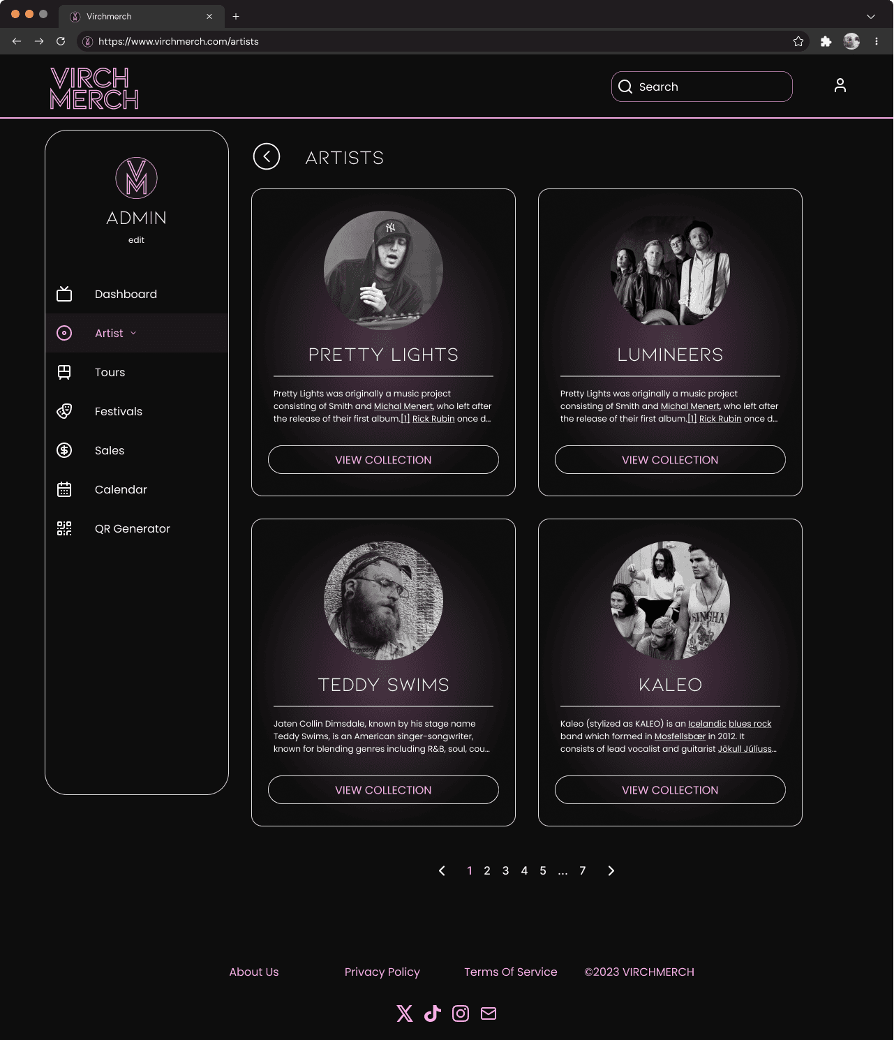
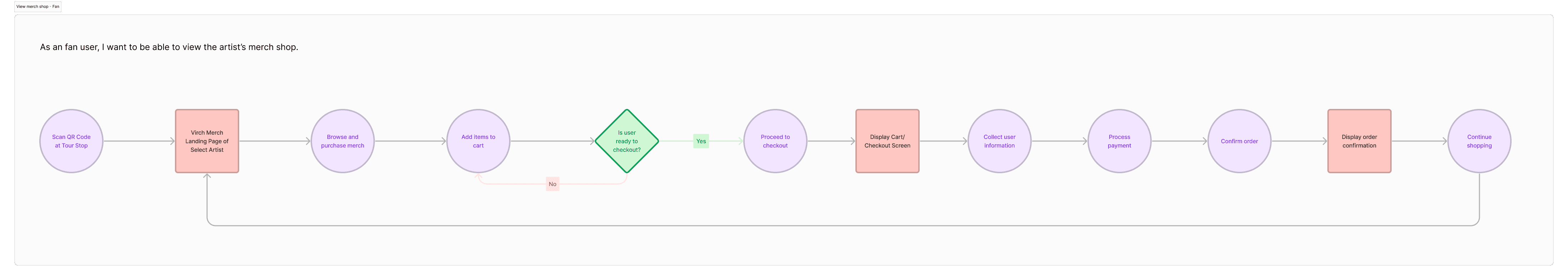
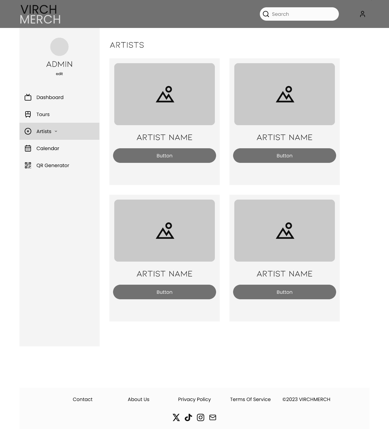
As a fan user, I want to view the artist’s merch shop
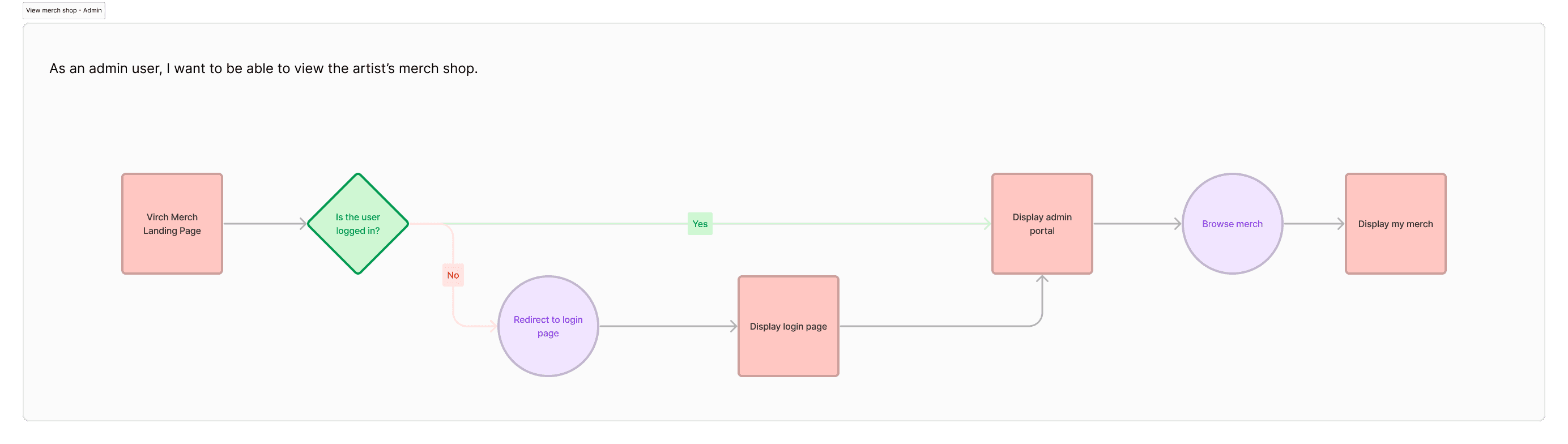
As an admin user, I want to be able to view the artist’s merch shop
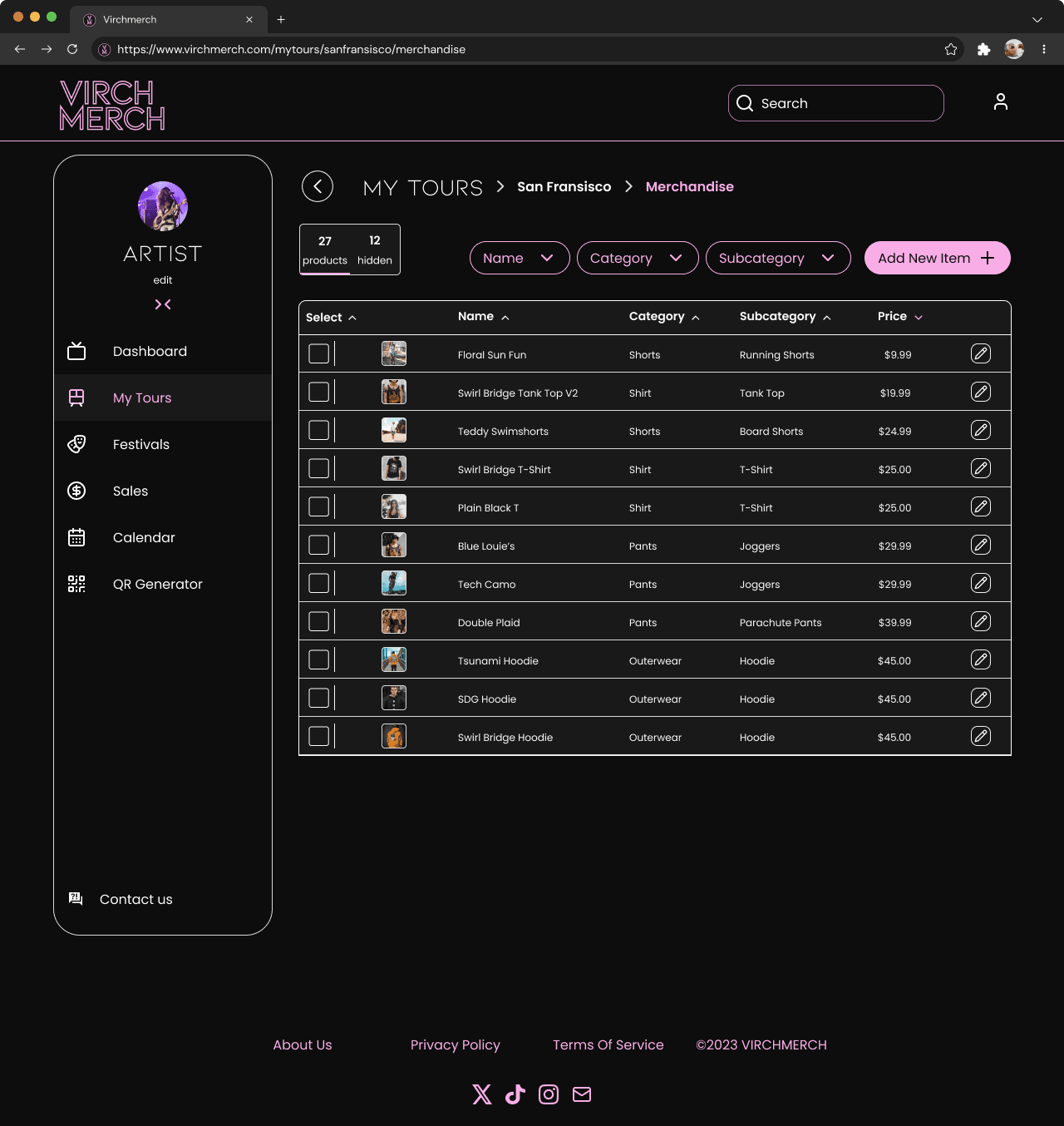
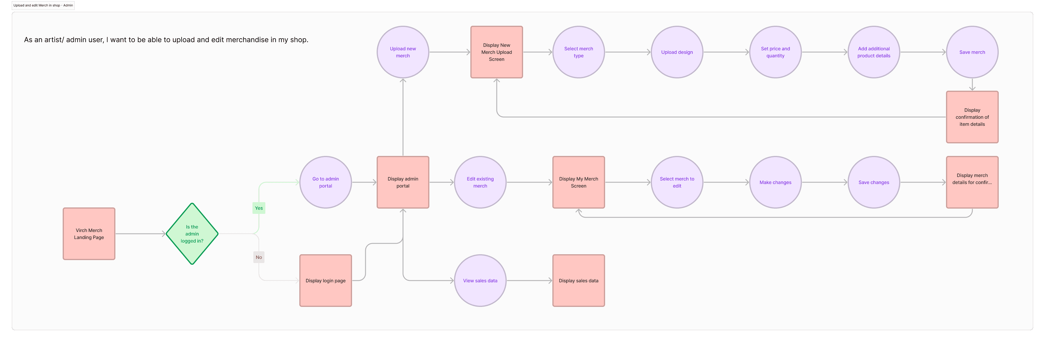
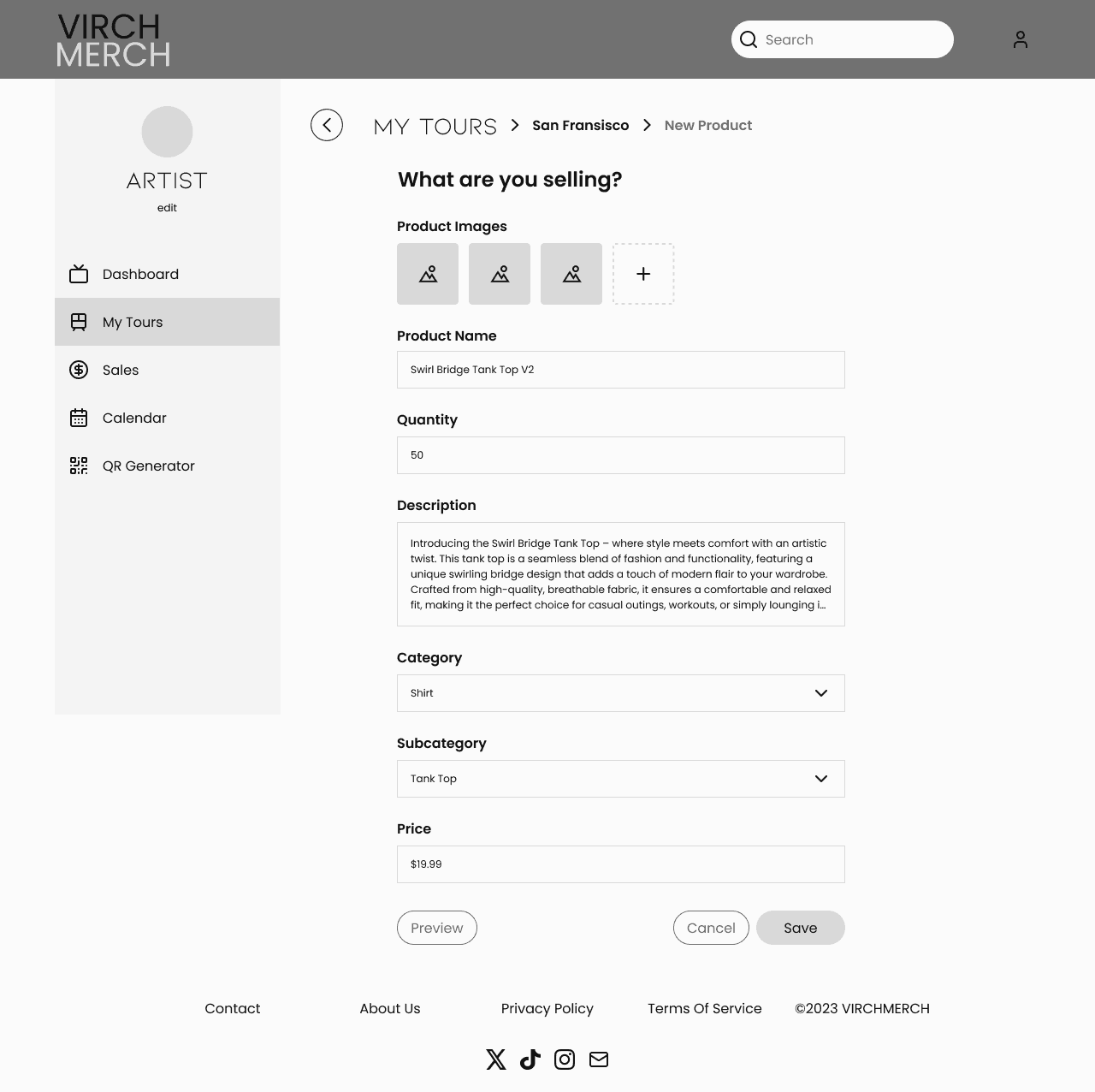
As an artist/ admin user, I want to be able to upload and edit merchandise in my shop
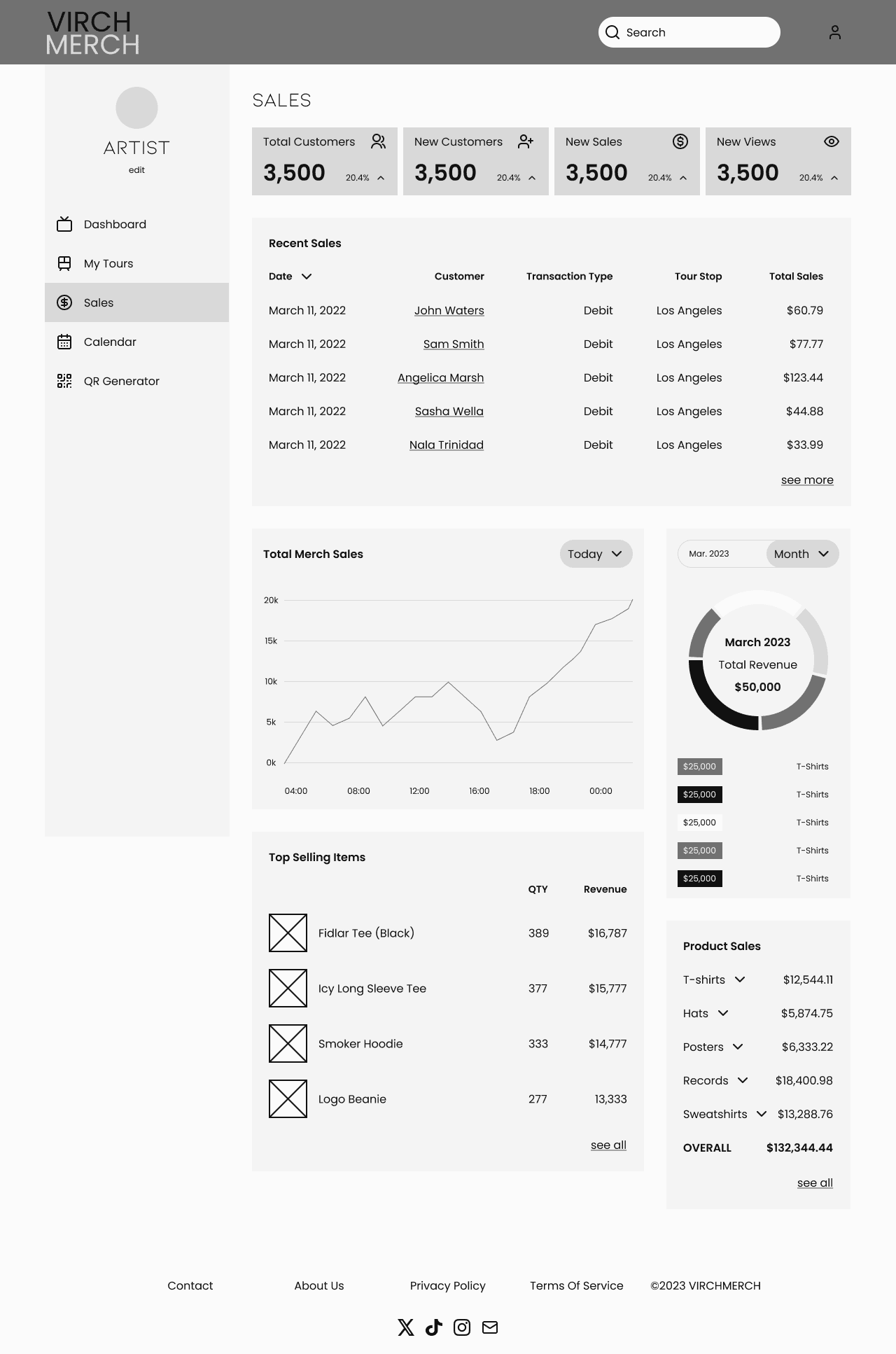
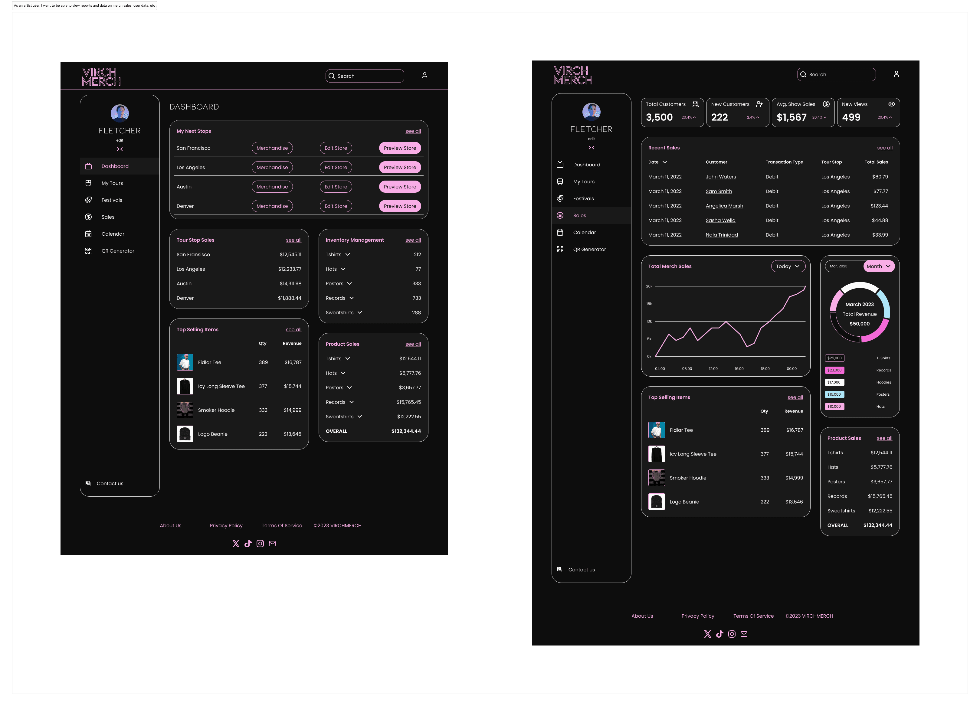
As an artist user, I want to be able to view reports and data on merch sales, user data, etc
With so many flows, we had planned to divide the work evenly, but we ended up hitting a roadblock. Initially, we were a team of five, but one of our designers could not move forward with the project. We had to accommodate for the extra work and the unflinching deadline. No worries, though; we quickly agreed on taking our initial two flows, and two of us took one extra they already had some insight for with consulting from the rest of us if necessary.
User Stories
We were provided with ten user stories from the client:
As a user, I want to be able to learn about Virch Merch from the landing page
As a fan user, I want to be able to create an account and log in
As an artist user, I want to be able to create an account and log in
As an admin user, I want to be able to create an account and log in
As an artist user, I want to be able to view my dashboard and see my tour stops
As an artist user, I want to see my archived tour stops.
As a fan user, I want to view the artist’s merch shop
As an admin user, I want to be able to view the artist’s merch shop
As an artist/ admin user, I want to be able to upload and edit merchandise in my shop
As an artist user, I want to be able to view reports and data on merch sales, user data, etc
With so many flows, we had planned to divide the work evenly, but we ended up hitting a roadblock. Initially, we were a team of five, but one of our designers could not move forward with the project. We had to accommodate for the extra work and the unflinching deadline. No worries, though; we quickly agreed on taking our initial two flows, and two of us took one extra they already had some insight for with consulting from the rest of us if necessary.
User Stories
We proceeded to develop ten detailed user flows from the stories provided. Each gave us a solid foundation for how we would structure our screens, and indicated where some screens would overlap-- such as the main landing page and fan landing page being used in other flows to get from point A to B.
Keeping track of this also meant we knew exactly how much we would need to build, and could collaborate more effectively moving forward.


Ideation 💡
Ideation 💡
Site Map
To help guide our website structure, our team created an internal site map. It served as a helpful reference for putting our screens in place and keeping track of how we would branch into other screens without running into any confusion.
Site Map
To help guide our website structure, our team created an internal site map. It served as a helpful reference for putting our screens in place and keeping track of how we would branch into other screens without running into any confusion.

Wireframes
For our Mid-fidelity wireframes, I took responsibility for the artist shop pages, purchasing page, about page, and item previews, working closely with my team to eliminate inconsistency. Dividing the iterations amongst ourselves made it easier to work quickly, while still allowing time for reviewing our design decsions.
I designed the shop template and purchasing page to be very familiar to a standard e-commerce website user. This lessens the learning curve for new customers, allowing fans to start buying their favorite merchandise with ease.
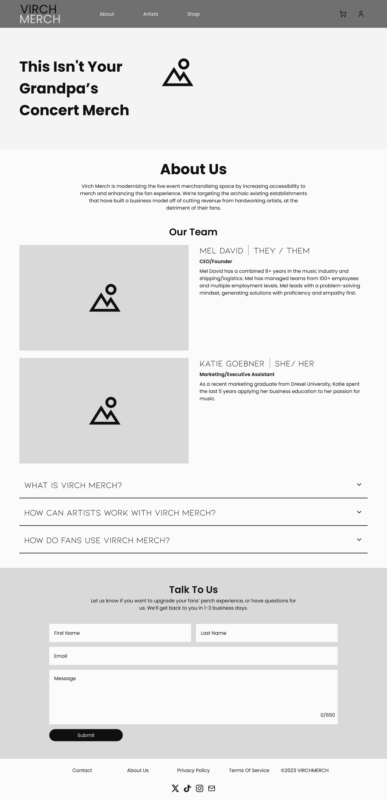
I also pushed to add a preview mechanic to the purchasing page, which would let customers take a quick look at the merchandise they were interested in while still enjoying the show. Finally, the About Page was made to give users a quick look at the team behind Virch Merch and offer more insight into the service, hence the FAQ and contact section.
Wireframes
For our Mid-fidelity wireframes, I took responsibility for the artist shop pages, purchasing page, about page, and item previews, working closely with my team to eliminate inconsistency. Dividing the iterations amongst ourselves made it easier to work quickly, while still allowing time for reviewing our design decsions.
I designed the shop template and purchasing page to be very familiar to a standard e-commerce website user. This lessens the learning curve for new customers, allowing fans to start buying their favorite merchandise with ease.
I also pushed to add a preview mechanic to the purchasing page, which would let customers take a quick look at the merchandise they were interested in while still enjoying the show. Finally, the About Page was made to give users a quick look at the team behind Virch Merch and offer more insight into the service, hence the FAQ and contact section.


Design 💻
Design 💻
UI Iterations
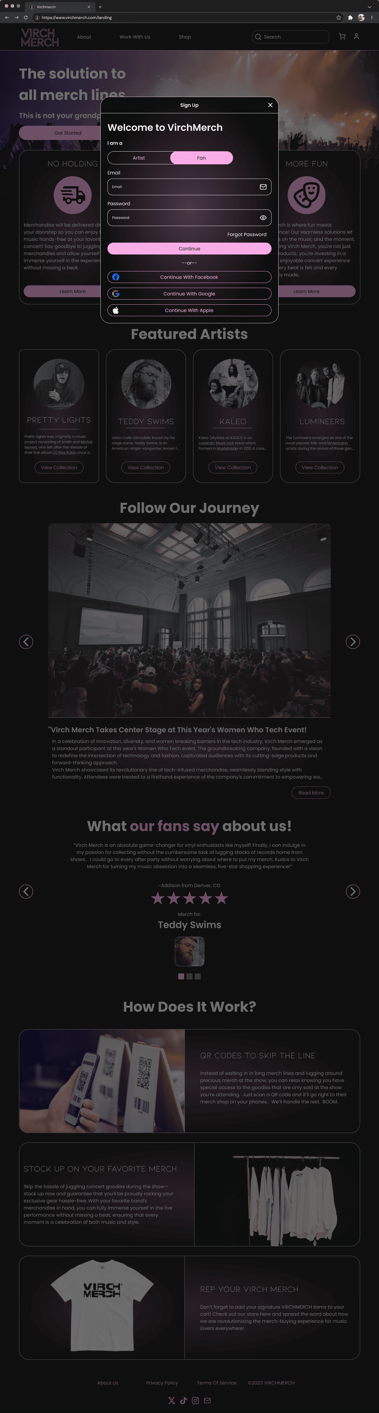
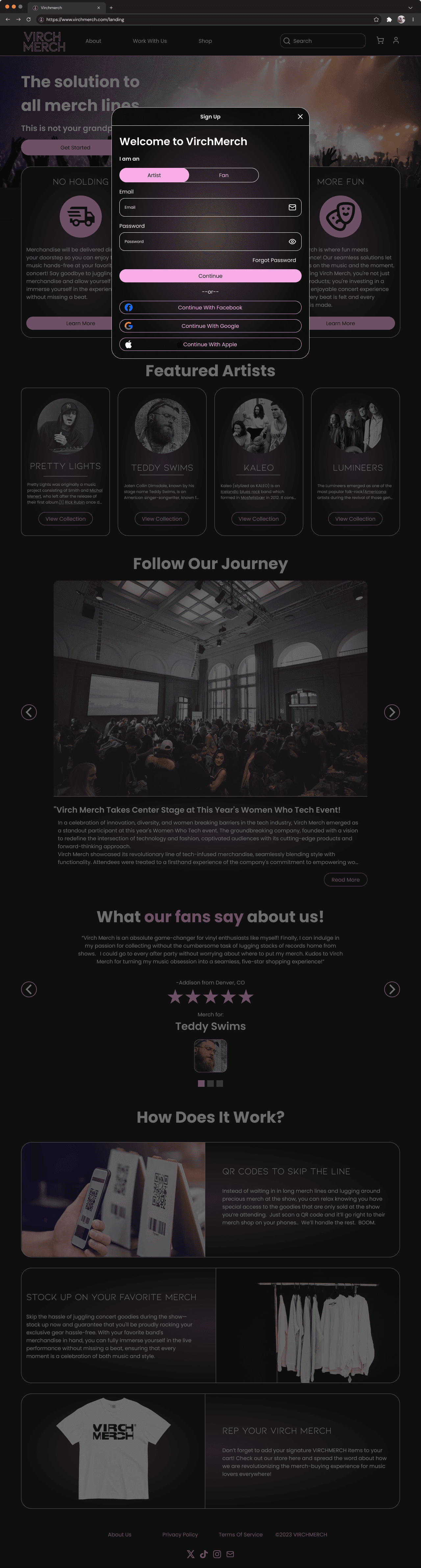
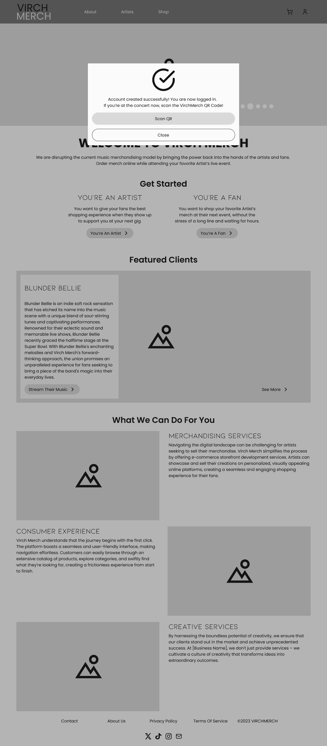
With a solid structure planned out, we now needed to push the boundaries of what the client described in their initial interview. We worked on several unique landing page based on the landing page wireframes, moving forward with 3 iterations to gauge the client's interest, with iteration 4 being our final design.
Iteration one was where I took the lead, looking to bring the "disruptive", "modern" and "seamless" energy they discussed in the questionnaire into my design. I wanted to play with loose, functional shapes and added a wavy texture to the header gradient to simulate sound waves.
For our final iteration, we decided to keep pink as the primary color and sole color, and replaced the textures with the soft glowing pinks with the idea of a sound 'mood lamp'. The soft rounded cards were also effective in outlining Virch Merch's services in an easy to digest way. We also wanted our final design to have clearer CTAs, so that any user - artist or fan - could get started from the same place rather than having to determine the right button.
UI Iterations
With a solid structure planned out, we now needed to push the boundaries of what the client described in their initial interview. We worked on several unique landing page based on the landing page wireframes, moving forward with 3 iterations to gauge the client's interest, with iteration 4 being our final design.
Iteration one was where I took the lead, looking to bring the "disruptive", "modern" and "seamless" energy they discussed in the questionnaire into my design. I wanted to play with loose, functional shapes and added a wavy texture to the header gradient to simulate sound waves.
For our final iteration, we decided to keep pink as the primary color and sole color, and replaced the textures with the soft glowing pinks with the idea of a sound 'mood lamp'. The soft rounded cards were also effective in outlining Virch Merch's services in an easy to digest way. We also wanted our final design to have clearer CTAs, so that any user - artist or fan - could get started from the same place rather than having to determine the right button.


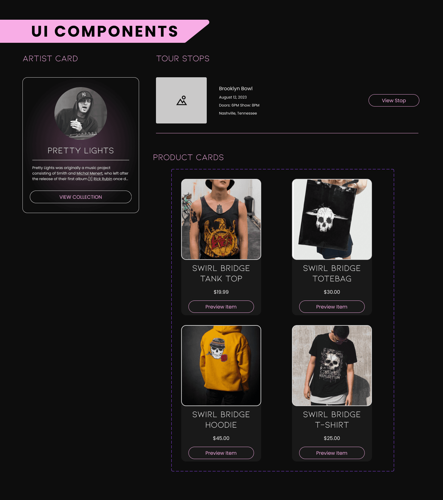
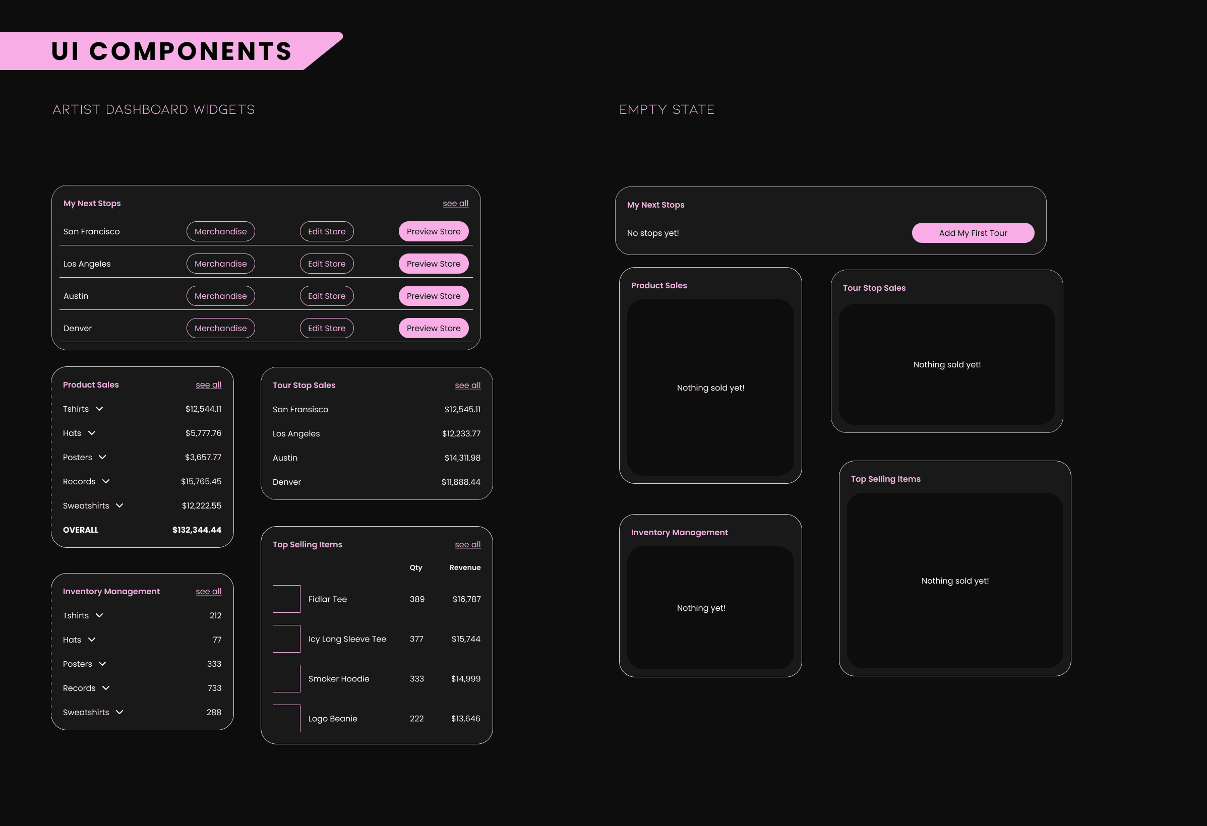
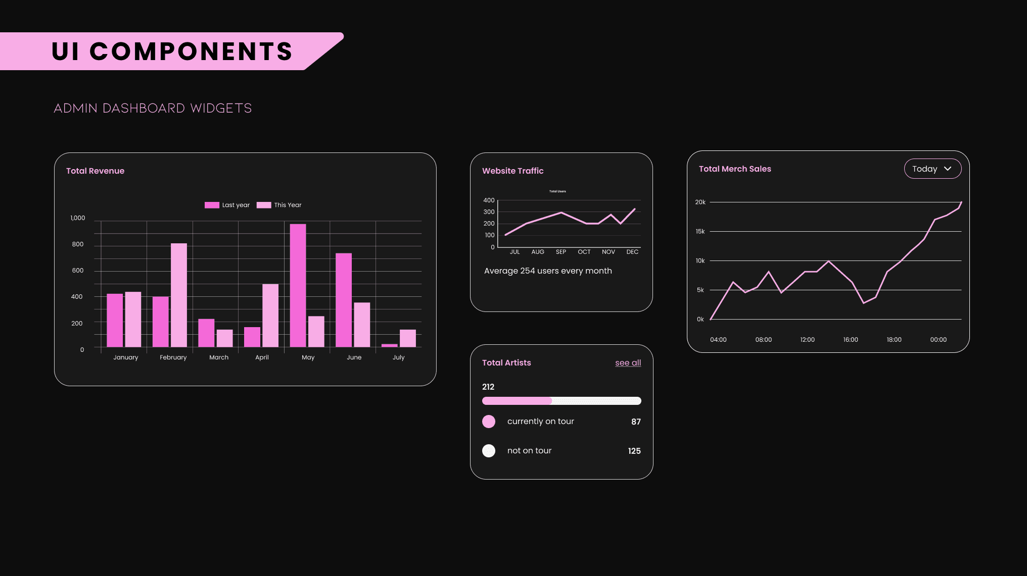
High Fidelity Wireframes
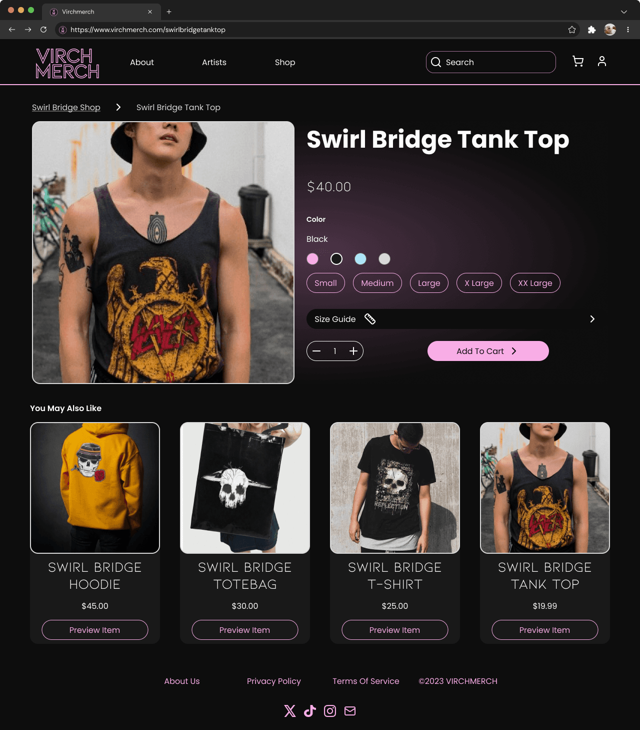
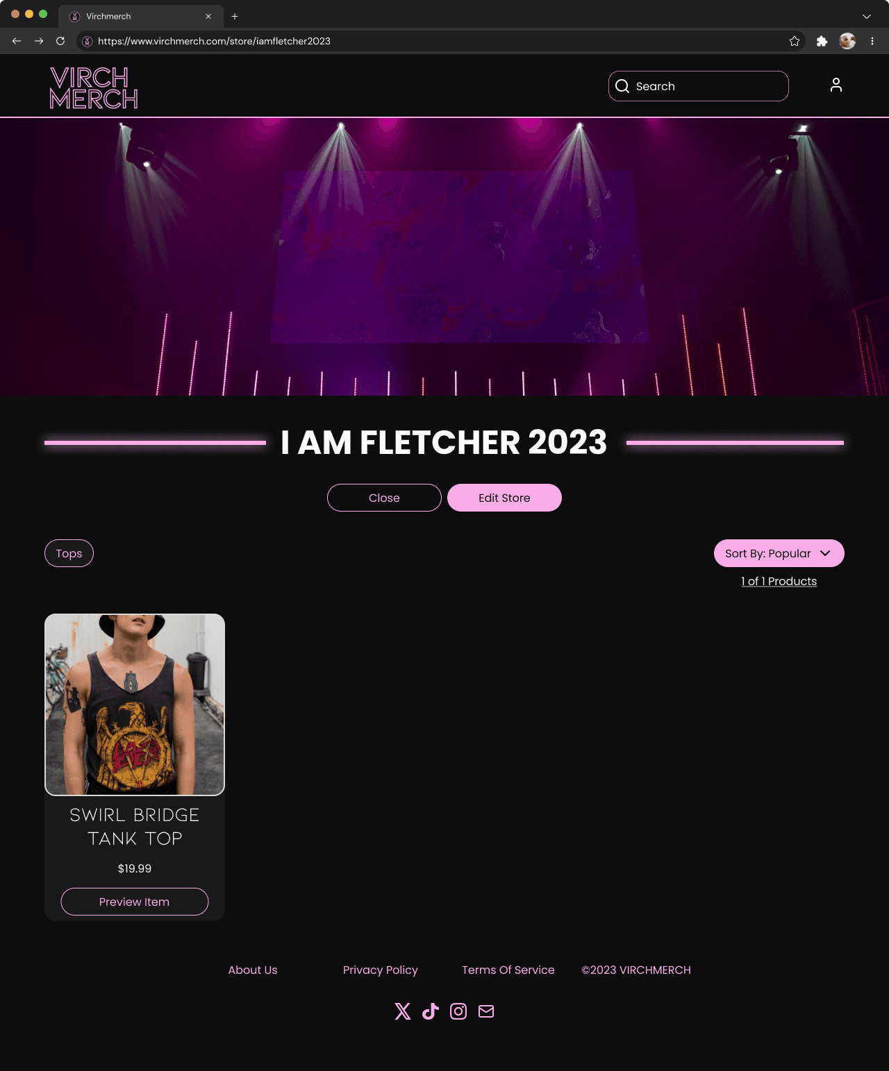
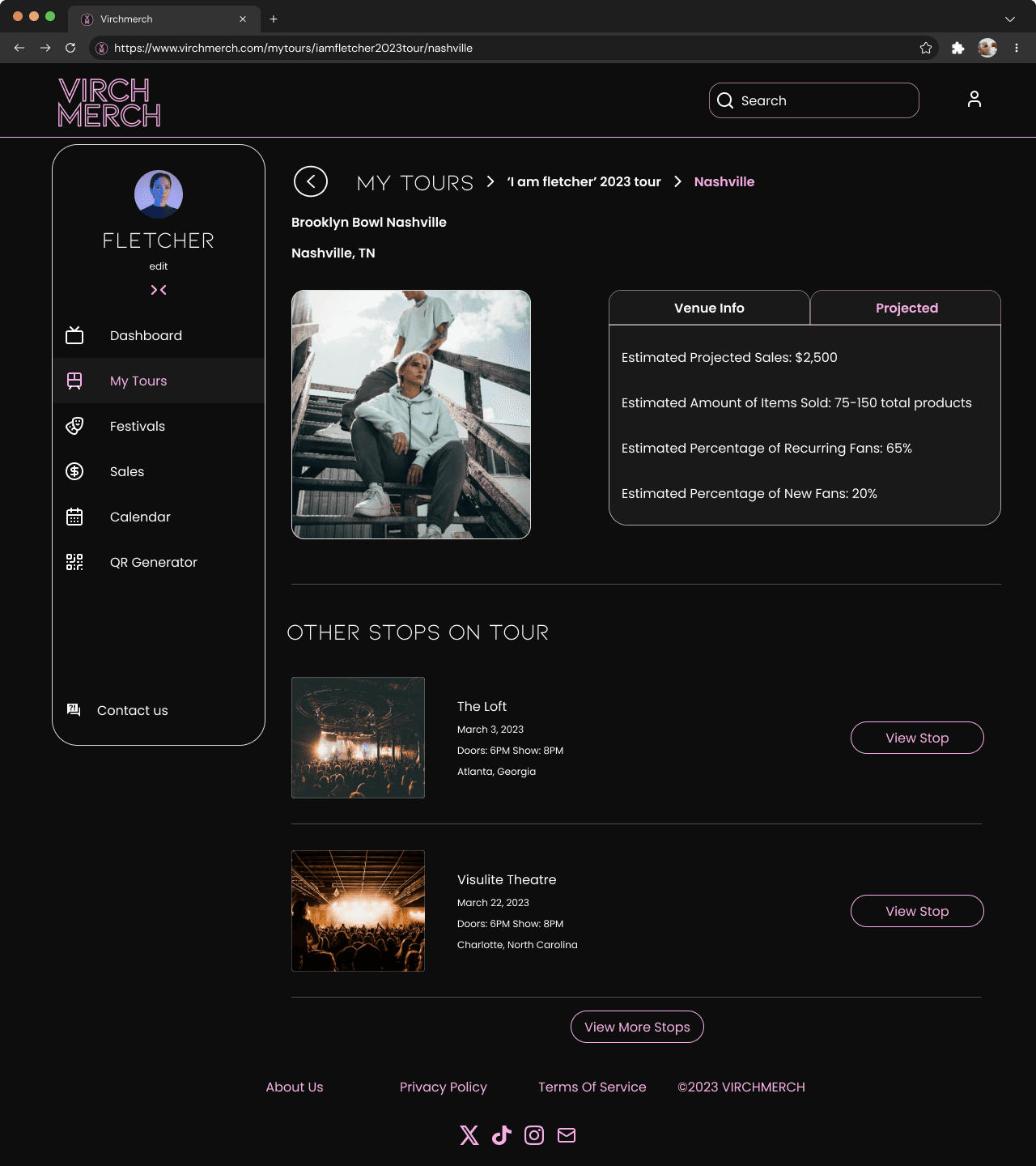
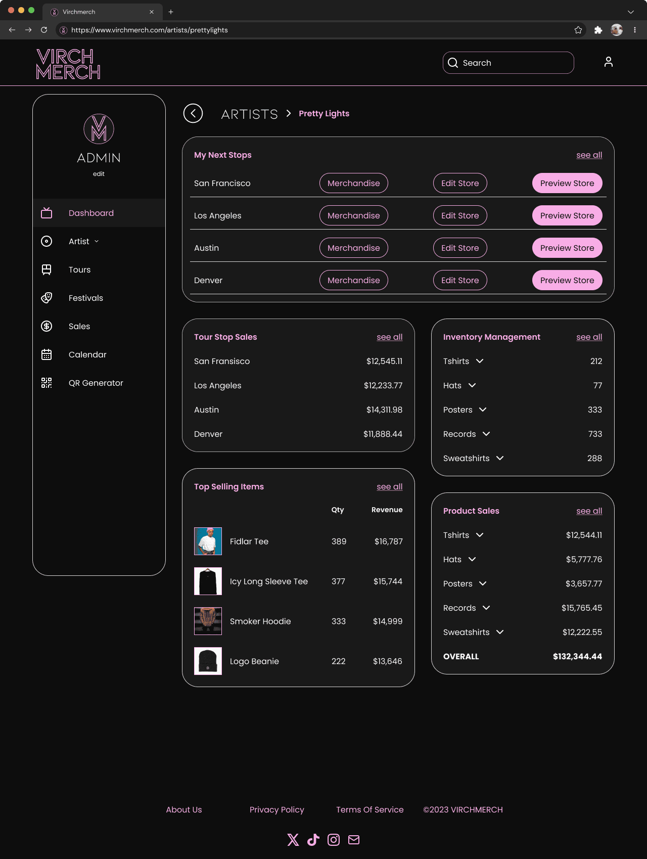
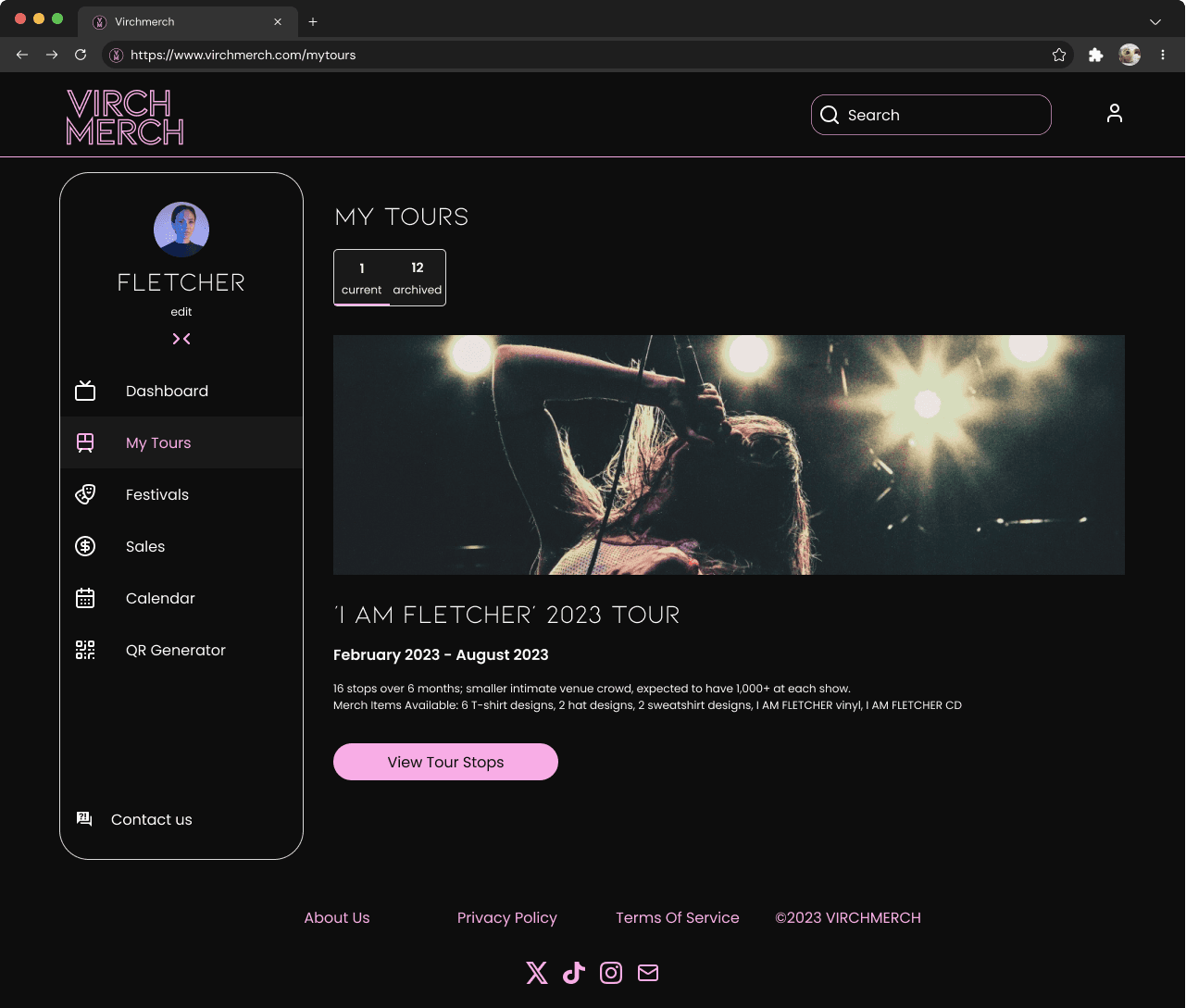
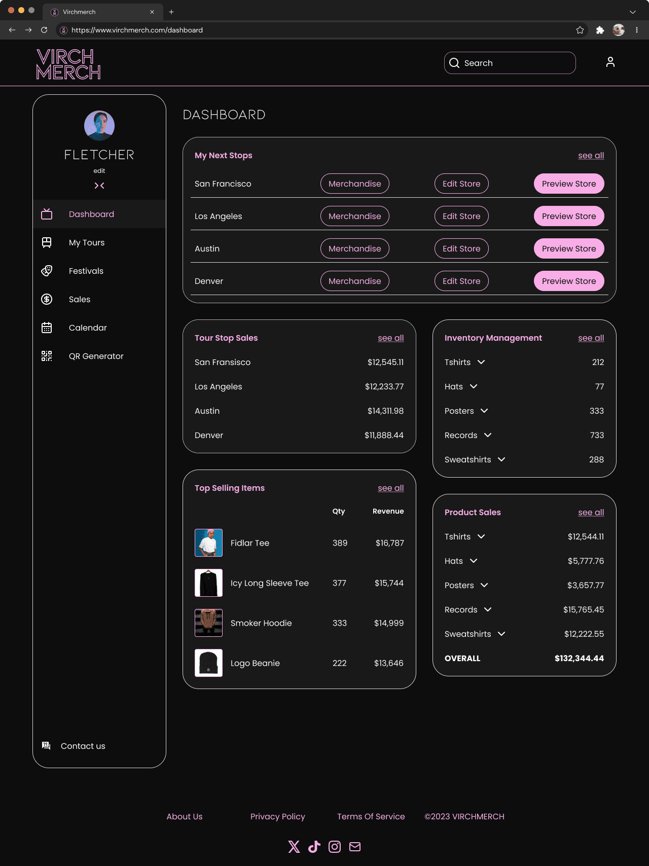
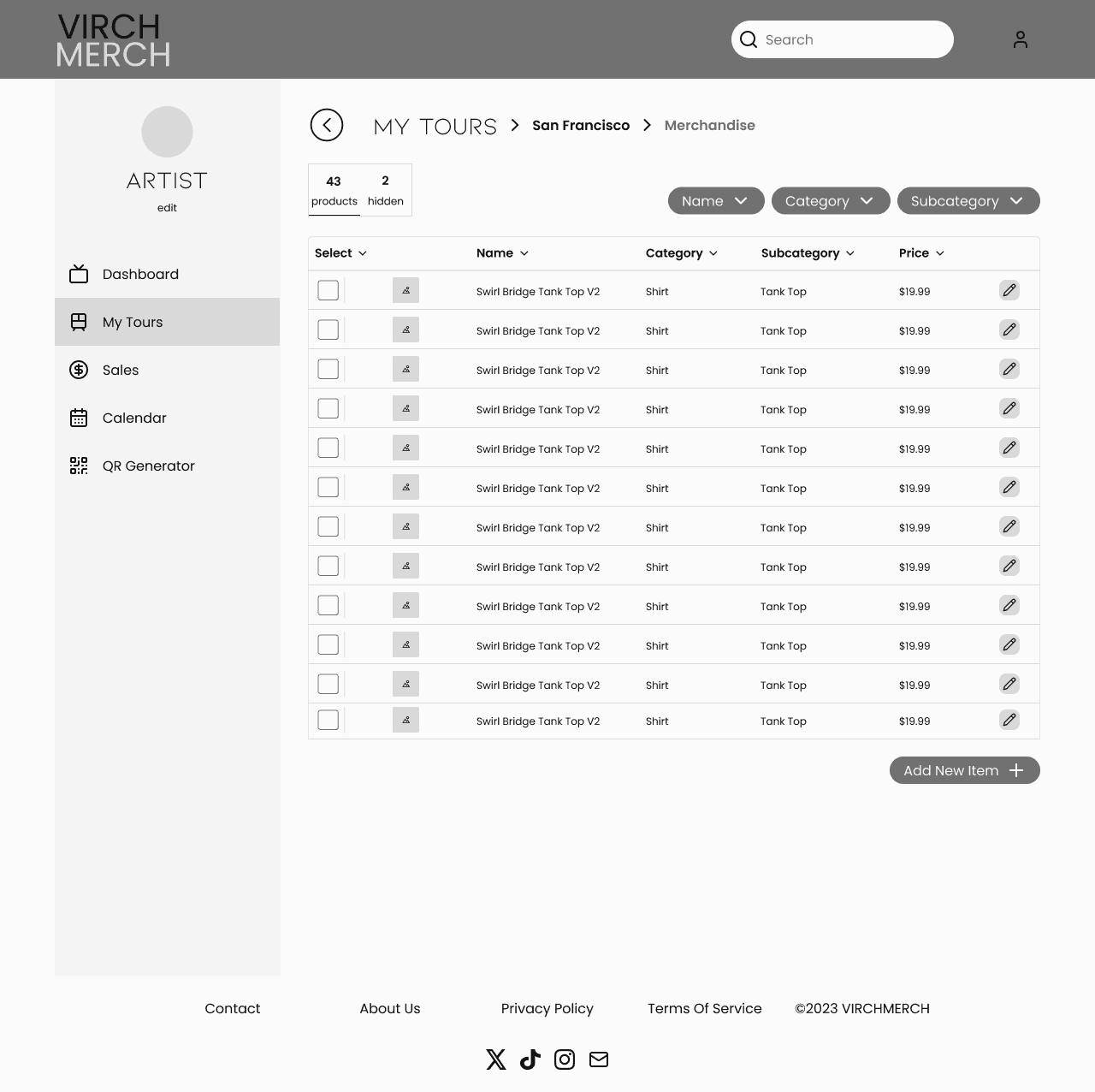
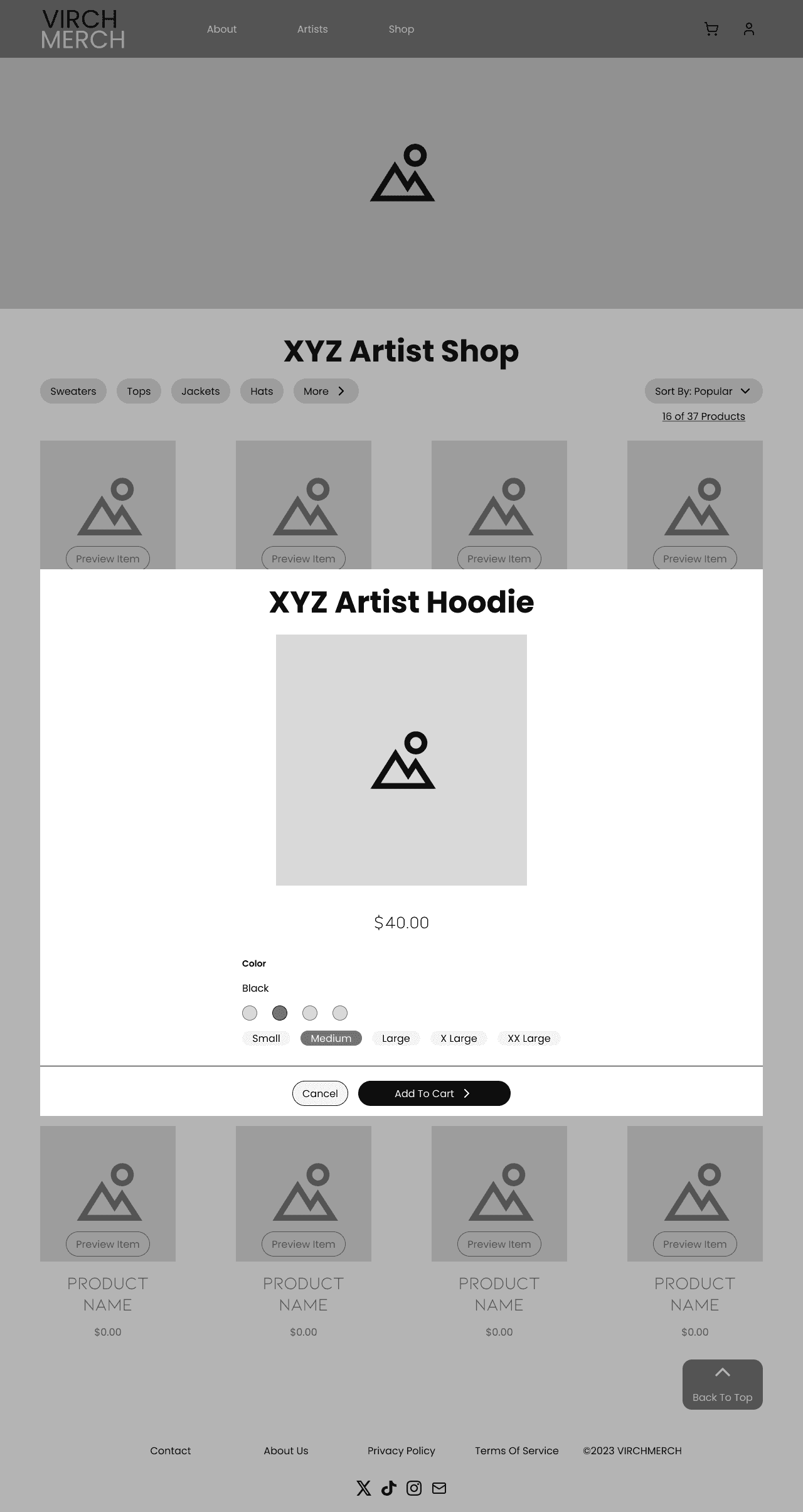
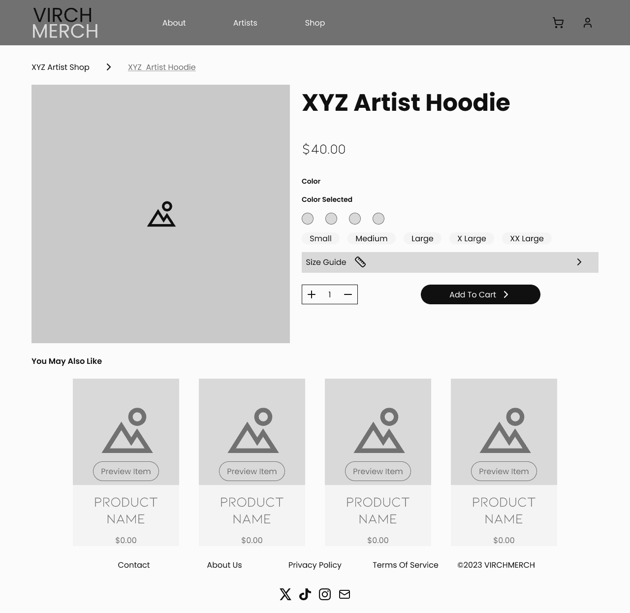
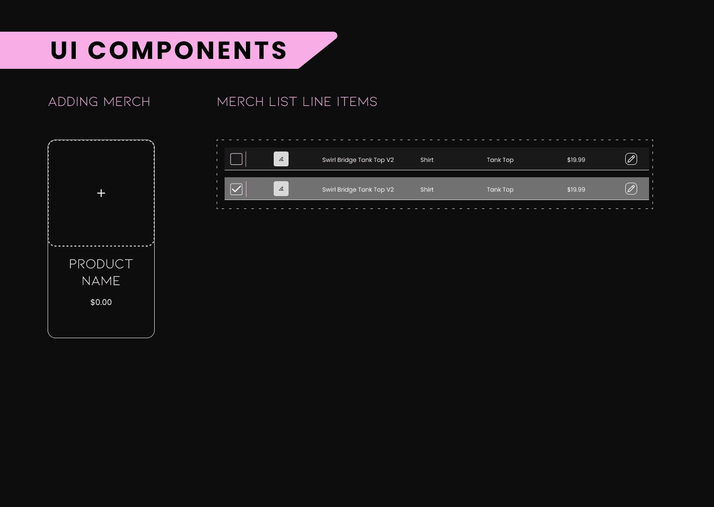
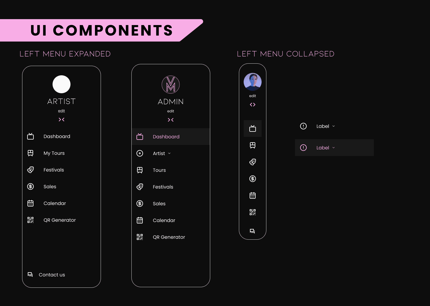
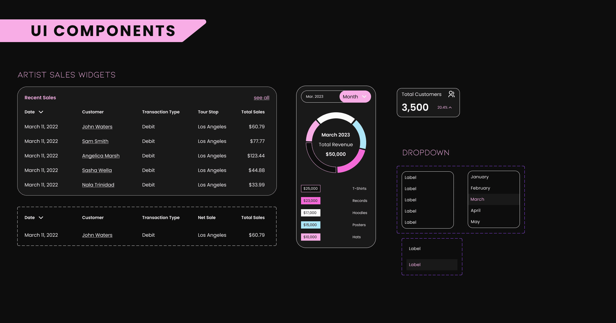
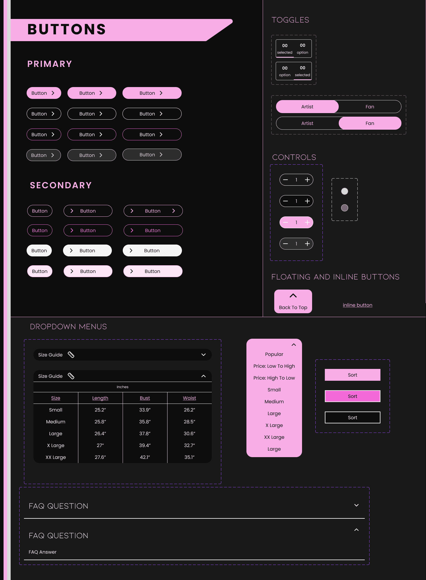
At this stage, we used the finalized landing page iteration as a reference for the visuals our hi-fi wireframes would have. My team and I focused primarily on building out the mid-fi wireframes we worked on previously, as we were familiar with them at that point, and lent support when needed. On the Artist Shop page, I designed product mockups to make the screen more faithful to a fully built-out shop. Since concerts are unlikely to sell a huge variety of merchandise to be on par with traditional retail e-commerce, I opted to allow users to scroll down and load sixteen items at a time instead of paginating the shops. Then they could come back to the top instantly with a "back to top" button. I also added a dropdown menu and tags to allow for simple sorting, with valuable insights from my team members to make sorting clear and remain consistent with the Artist Shop backend pages.
When designing the preview page, I wanted to make it a quick and unintrusive way to add an item to your cart. There would be a default color selected, along with the image of the color shown, so someone in a hurry to order it would get exactly what they see and be able to change it if they wanted to. The only obstacle to adding the item to their cart would be if they didn't select a size; the color won't matter if the item doesn't fit.
I designed another dropdown menu for the About page's FAQ, and the individual product page's size guide. It can be tricky to create a dropdown because you have to be mindful of if and how it should affect the contents around it-- while the About page was fairly simple, many size guides are built as pop-ups in similar product page layouts. I opted to make it a dropdown though, because a pop-up could frustrate users trying to make an on-the-spot purchase, and the size dropdown is not very long or obtrusive.
High Fidelity Wireframes
At this stage, we used the finalized landing page iteration as a reference for the visuals our hi-fi wireframes would have. My team and I focused primarily on building out the mid-fi wireframes we worked on previously, as we were familiar with them at that point, and lent support when needed. On the Artist Shop page, I designed product mockups to make the screen more faithful to a fully built-out shop. Since concerts are unlikely to sell a huge variety of merchandise to be on par with traditional retail e-commerce, I opted to allow users to scroll down and load sixteen items at a time instead of paginating the shops. Then they could come back to the top instantly with a "back to top" button. I also added a dropdown menu and tags to allow for simple sorting, with valuable insights from my team members to make sorting clear and remain consistent with the Artist Shop backend pages.
When designing the preview page, I wanted to make it a quick and unintrusive way to add an item to your cart. There would be a default color selected, along with the image of the color shown, so someone in a hurry to order it would get exactly what they see and be able to change it if they wanted to. The only obstacle to adding the item to their cart would be if they didn't select a size; the color won't matter if the item doesn't fit.
I designed another dropdown menu for the About page's FAQ, and the individual product page's size guide. It can be tricky to create a dropdown because you have to be mindful of if and how it should affect the contents around it-- while the About page was fairly simple, many size guides are built as pop-ups in similar product page layouts. I opted to make it a dropdown though, because a pop-up could frustrate users trying to make an on-the-spot purchase, and the size dropdown is not very long or obtrusive.


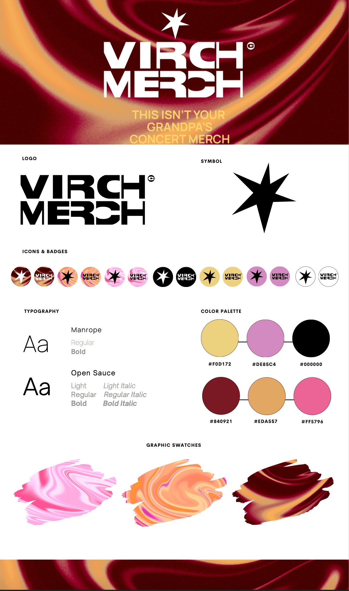
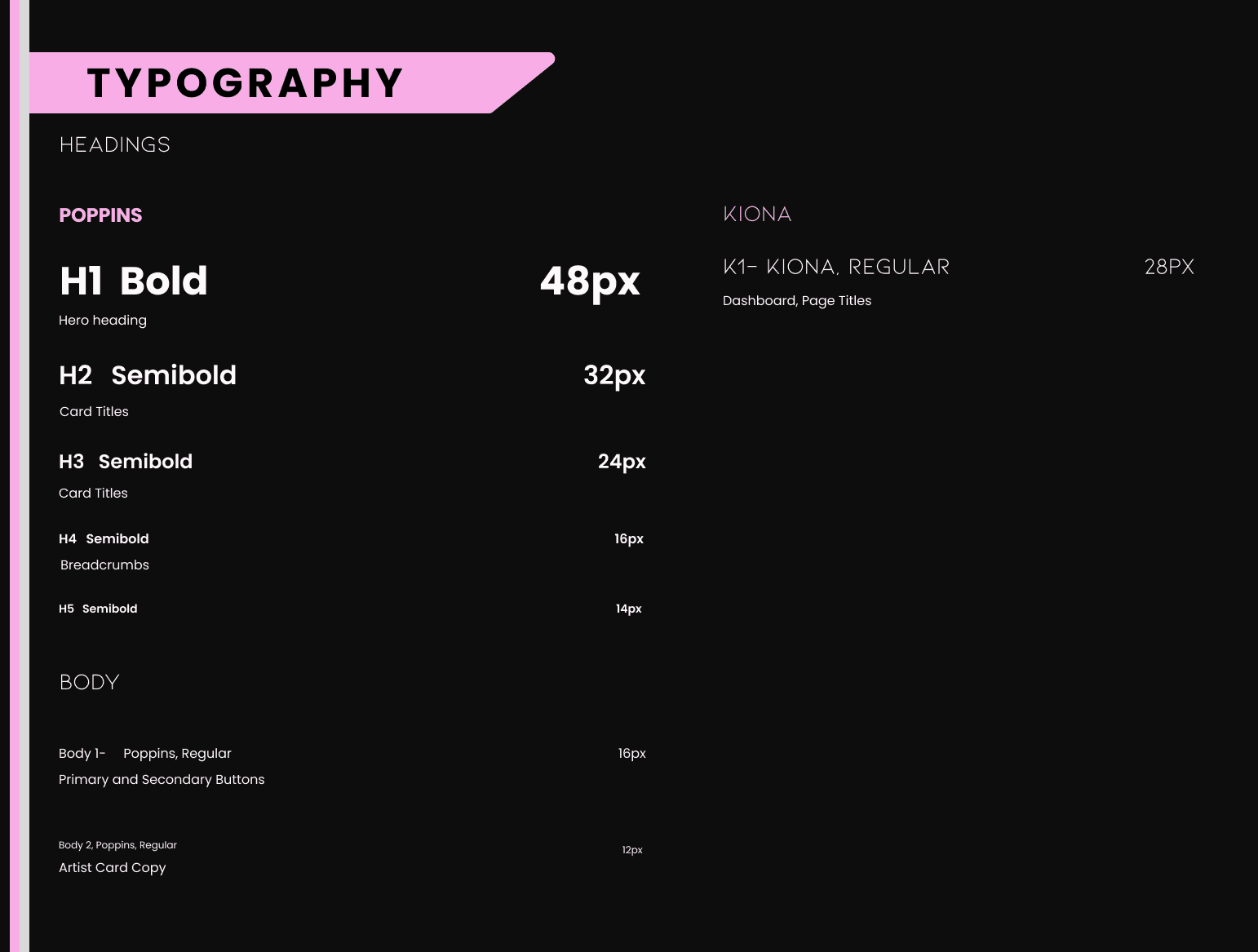
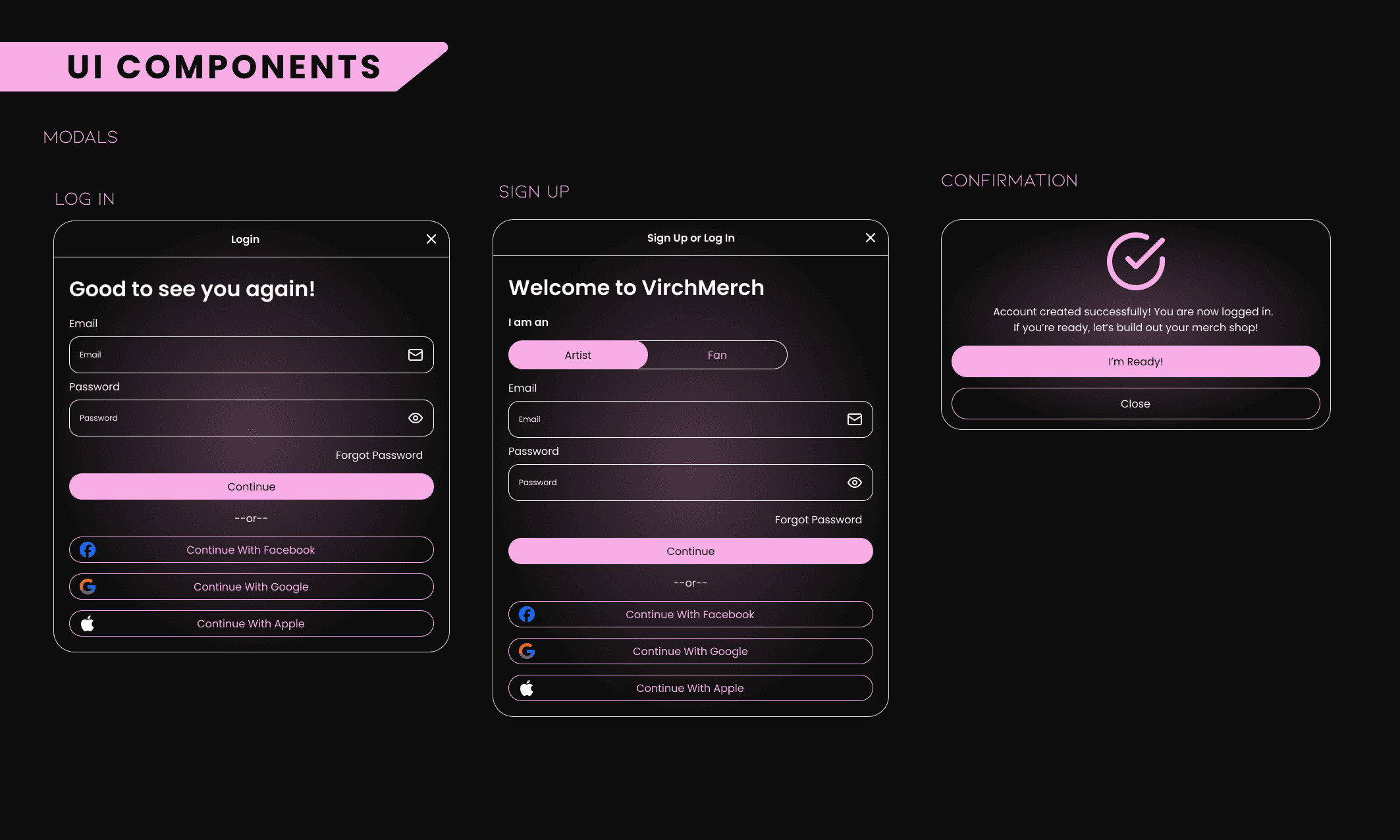
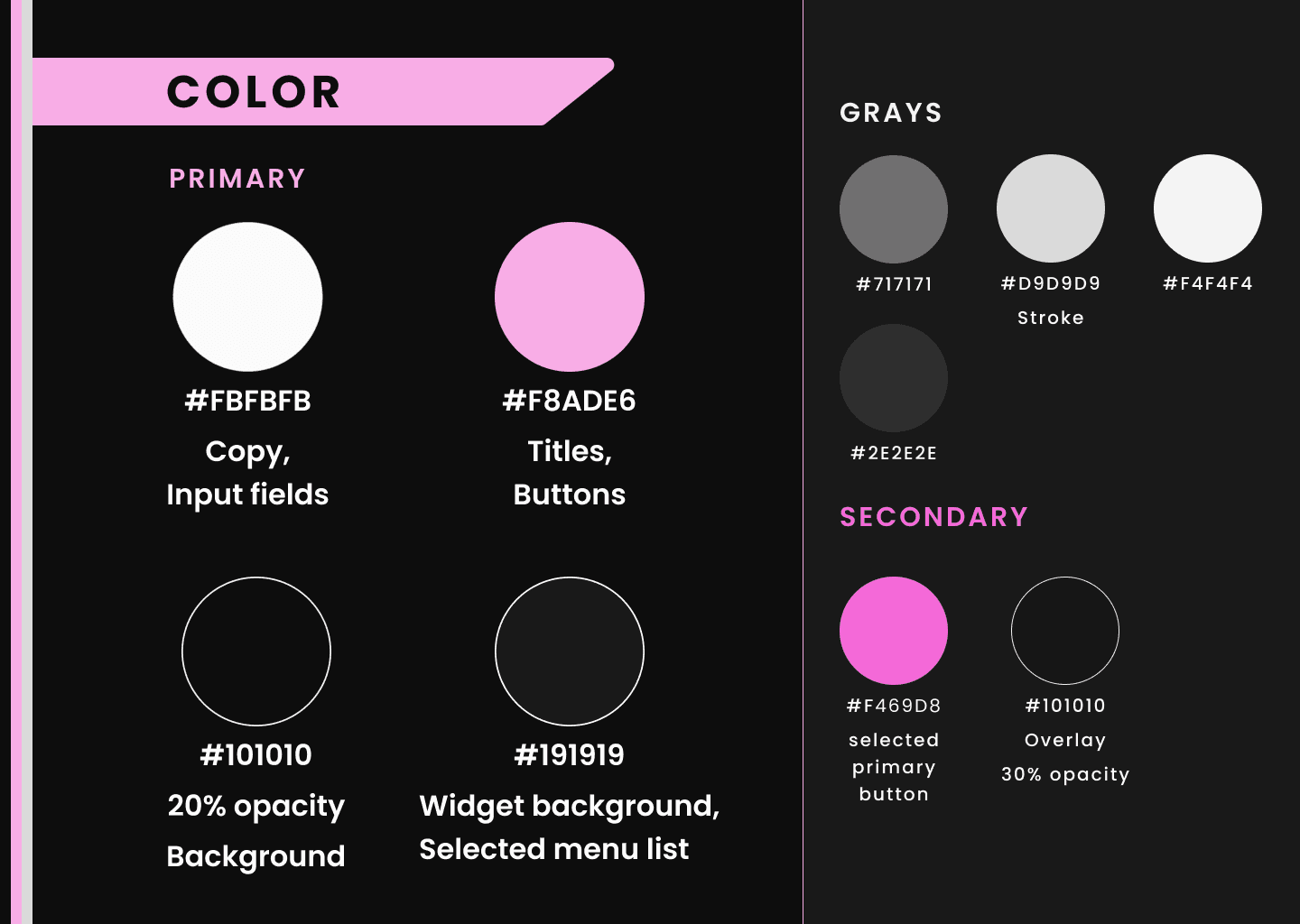
Style guide
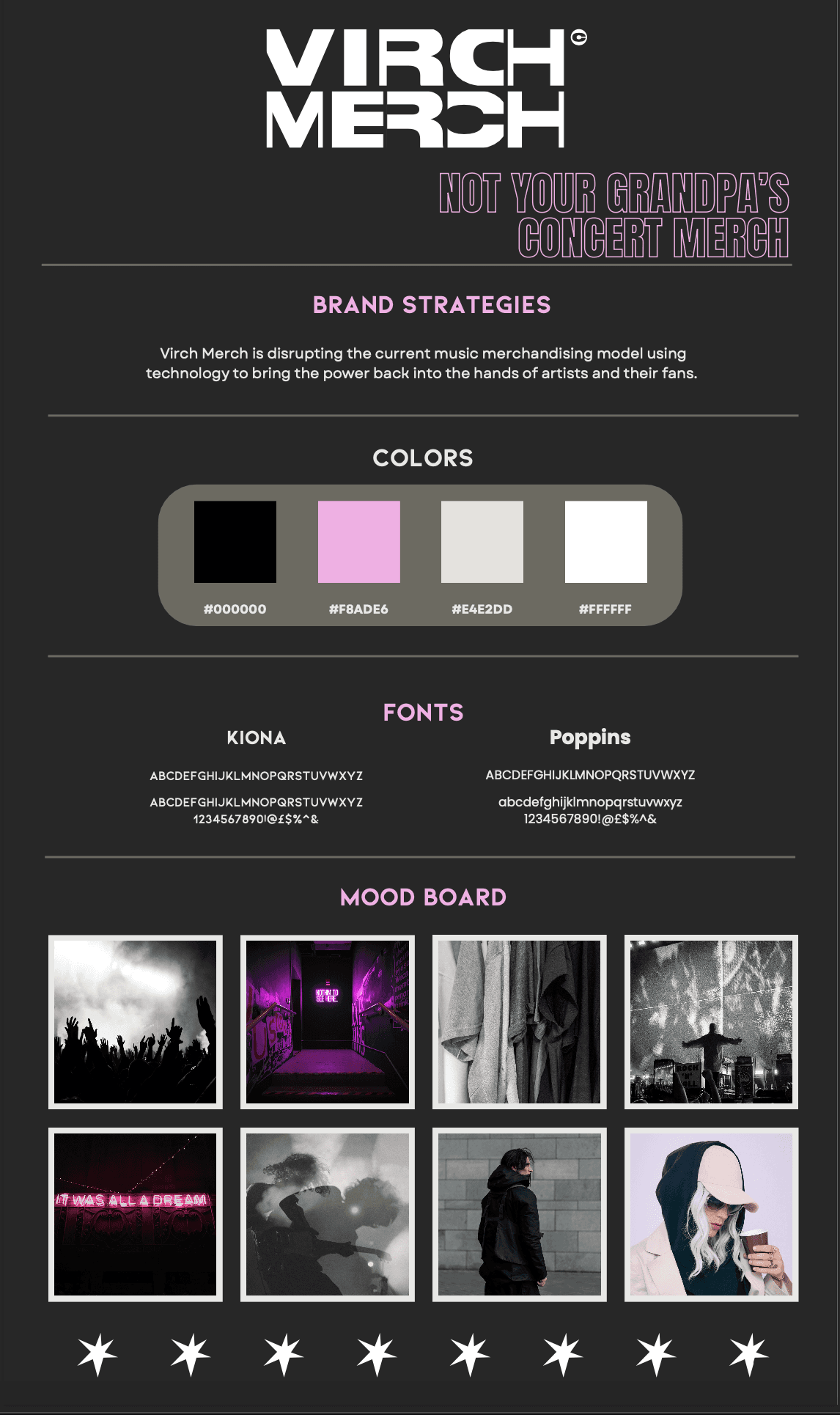
The Virch Merch team emphasized that we could take liberties with their branding, so we created a detailed style guide to illustrate our choices. We took inspiration from their competitors and other modern, gen-z/millenial centric music websites like Spotify when creating our components, choosing colors, and building typography.
Some of the components I created include the dropdown menu and controls sections, working alongside my team to ensure consistency. The sorting dropdown menu has square buttons, so that it doesn't look out of place with the straight sides of the menu itself, and keeping on model with the rounded squares that were our primary information containers.
I also created the Product Card variants, to give the client a better idea of what an artist's built-out store would look like on their platform, as well as collaborating with my fellow designers on crafting buttons, navigation, input fields, and wherever else I was needed.
Style guide
The Virch Merch team emphasized that we could take liberties with their branding, so we created a detailed style guide to illustrate our choices. We took inspiration from their competitors and other modern, gen-z/millenial centric music websites like Spotify when creating our components, choosing colors, and building typography.
Some of the components I created include the dropdown menu and controls sections, working alongside my team to ensure consistency. The sorting dropdown menu has square buttons, so that it doesn't look out of place with the straight sides of the menu itself, and keeping on model with the rounded squares that were our primary information containers.
I also created the Product Card variants, to give the client a better idea of what an artist's built-out store would look like on their platform, as well as collaborating with my fellow designers on crafting buttons, navigation, input fields, and wherever else I was needed.


Developer Handoff 🧑💻
Developer Handoff 🧑💻
Developer Handoff
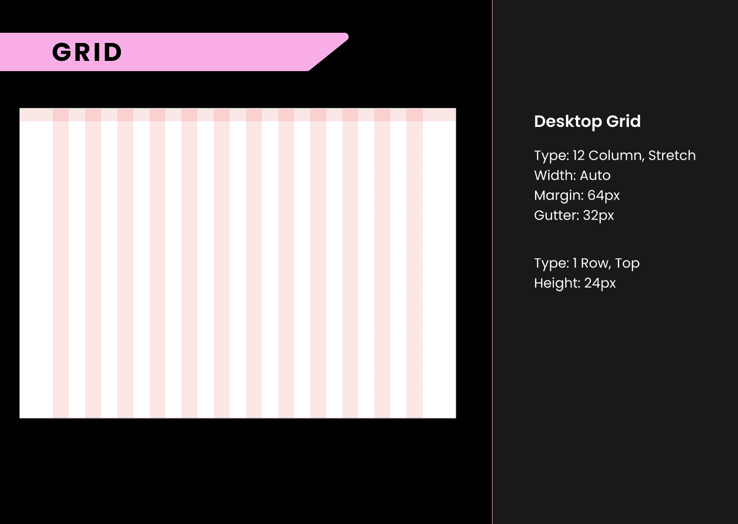
In a bit of a crunch for time, we needed to quickly but effectively annotate our files for the development team so they could bring Virch Merch to life. We illustrated the flow of movement from screen to screen with manual notes, as well as utilizing a Figma plugin called Measurements to get a detailed snapshot of the spacing, colors, padding, etc of our pages. Of course, we made sure to triple-check it so that any spare (or extraneous) details were ironed out.
Developer Handoff
In a bit of a crunch for time, we needed to quickly but effectively annotate our files for the development team so they could bring Virch Merch to life. We illustrated the flow of movement from screen to screen with manual notes, as well as utilizing a Figma plugin called Measurements to get a detailed snapshot of the spacing, colors, padding, etc of our pages. Of course, we made sure to triple-check it so that any spare (or extraneous) details were ironed out.

Reflection 🪞
Reflection 🪞
In The Past
This project was a big challenge for me; not only because it would be my first time designing for AI, but also because working with a team in about 3 different timezones - including a 6 hour difference for the CEO and COS in Switzerland - made consistent communication of the utmost importance. My challenges during this project empowered me to speak up and ask questions to ensure I delivered a high-quality product. Ultimately, compared to the original website, Homnox has become more visually engaging, with an interactive generative AI element and a sleek new design.
In The Future
As Homnox tests this current iteration, I anticipate there will be a need to optimize the user experience further. While we looked into best practices for AI image generation UX and how that could relate to real estate, this was an incredibly quick and experimental project: you can’t get it all right on the first try. There could be a more real estate focus on the home collection section, opting to center on pricing for homes and locations for example. The menu itself could also be simplified, rather than being a learning curve for users. Any assumptions or hindsight I have now would be better placed in the next steps though— iterating based on user feedback.