

Overview
Overview
Surprise Me! is a gift registry where people can "surprise" their loved ones with gifts that they know they want. Users create wish lists that consist of different physical items, events, or even local places they'd like to visit, and their friends can browse their interests and determine what they would be able to do for them. This project was originally created for school; this case study is following me as I reexamine and revamp that work.
Problem
Surprises aren't welcome if they're bad surprises.
Many people like to surprise their loved ones in some way, but the effect can be lost if the surprise is not something the loved one wants. While this can be solved by directly telling someone what you would like, the impact can be less powerful if you know it’s coming. The main issue:
Recieving a surprise that is unwanted can have an unintended, and sometimes even negative impact on the recipient, but that does not mean such surprises don’t add value to people’s lives
Solution
Change the way we define surprises by surprising loved ones, with exactly what they want.
My solution was to create a gift registry with an emphasis on giving users the freedom to go into detail about what they want, even if that ‘want’ is not a physical gift to be bought. The main solutions are:Users can add items to their wish list and create detailed descriptions of what they want without reaching out to another person, spelling out what they want without pressuring anyone Users can anonymously add their friend’s items to their saved list to keep track of them
⏰
Timeline: 5 weeks
👥
Role: Sole UX/UI Designer, UX Researcher
🧰
Tools: Figma, Google Forms, Miro, Google Meets
1 - Research 📊
1 - Research 📊
Competitive Analysis
I looked at 3 different apps with similar functionality to Surprise Me!: Elfster, Giftful, and Santa's Secret Keeper.
Santa's Secret Keeper: provided one real function, being a way to contact multiple people at once and add them to a mailing list so you could inform people about the gift-giving event. Then, you can randomly assign people to get a gift secretly for someone else.
Giftful: geared towards getting people things without them having to mention it, hence a wishlist, but did not have a place for people to create a profile or bio of themselves, and elaborate on what they were looking for.
Elfster: well-rounded and has a lot of variety for creating a wishlist, it generally takes you to links from shopping websites and asks what "quantity" of the item you want-- but doesn't take into account that a wishlist could just be a place or event you want to go with your friends.
Hearing From Potential Users
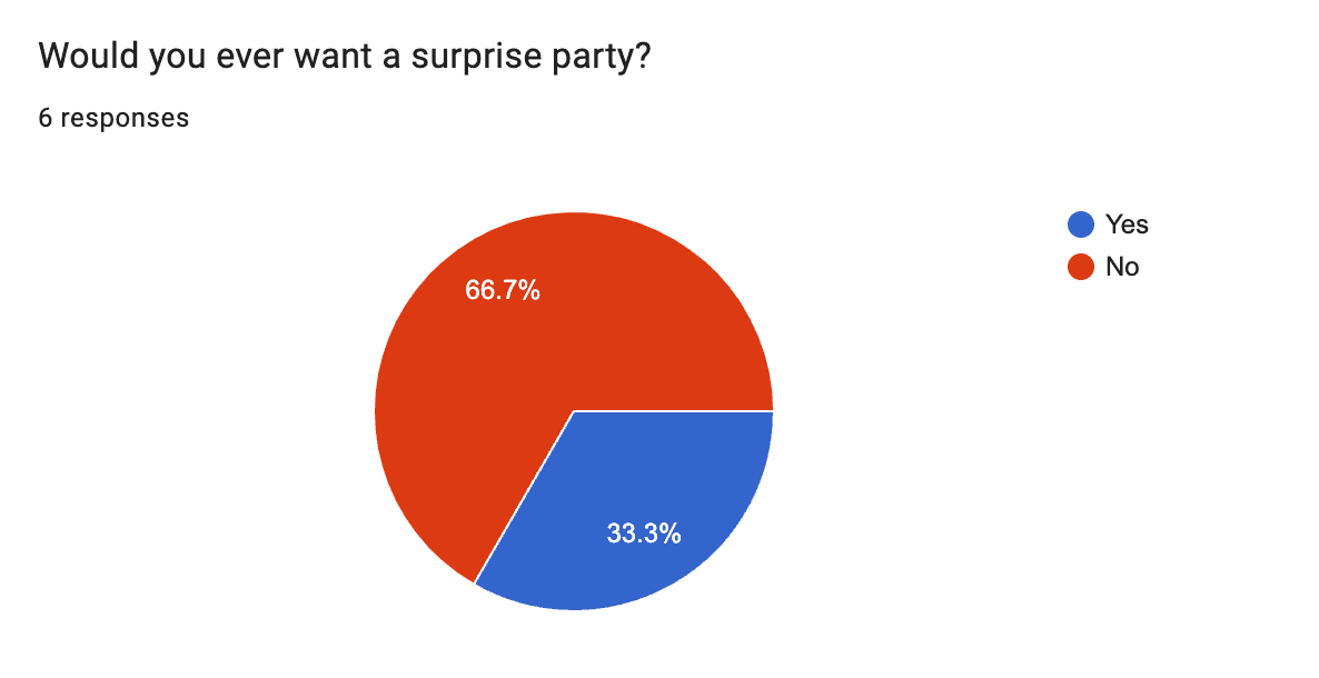
At the beginning of this project, I created a problem statement based on assumptions I had before reaching out to potential users: Surprise parties are meant as kind gestures to a loved one you care for when they least expect it. However, they can have a negative effect if done poorly. I then surveyed six individuals on their opinions regarding surprise parties. Many of them had never been thrown a surprise party, and only half had even participated in one.
When asked whether or not they even wanted a surprise party, 66.7% said no. Respondents described not enjoying surprises, or that they "don’t like when the spotlight is on them", Another respondent mentioned they wouldn't necessarily mind, but, "Maybe I'm feeling like garby for the event, and the party might make it worse! Maybe I don't want a "party worth" of people around to witness my bad mood."
A "garby" mood could indeed be a detriment to any sort of party, so I ventured further to see what a respondent's “ideal” party might look like, surprise or not. The most common answers were a bit surprising: A small party with friends, usually while playing games and eating good food.
It wasn't about having an actual surprise so much as being able to do something they enjoy with people they like in an expected way. If I wanted to move forward with this project faithfully, I had to adjust my initial direction to focus on wanted surprises, rather than shoehorning an actual surprise party.
Hearing From Potential Users
At the beginning of this project, I created a problem statement based on assumptions I had before reaching out to potential users: Surprise parties are meant as kind gestures to a loved one you care for when they least expect it. However, they can have a negative effect if done poorly. I then surveyed six individuals on their opinions regarding surprise parties. Many of them had never been thrown a surprise party, and only half had even participated in one.
When asked whether or not they even wanted a surprise party, 66.7% said no. Respondents described not enjoying surprises, or that they "don’t like when the spotlight is on them", Another respondent mentioned they wouldn't necessarily mind, but, "Maybe I'm feeling like garby for the event, and the party might make it worse! Maybe I don't want a "party worth" of people around to witness my bad mood."
A "garby" mood could indeed be a detriment to any sort of party, so I ventured further to see what a respondent's “ideal” party might look like, surprise or not. The most common answers were a bit surprising: A small party with friends, usually while playing games and eating good food.
It wasn't about having an actual surprise so much as being able to do something they enjoy with people they like in an expected way. If I wanted to move forward with this project faithfully, I had to adjust my initial direction to focus on wanted surprises, rather than shoehorning an actual surprise party.


Competitive Analysis
I looked at 3 different apps with similar functionality to Surprise Me!: Elfster, Giftful, and Santa's Secret Keeper.
Santa's Secret Keeper: provided one real function, being a way to contact multiple people at once and add them to a mailing list so you could inform people about the gift-giving event. Then, you can randomly assign people to get a gift secretly for someone else.
Giftful: geared towards getting people things without them having to mention it, hence a wishlist, but did not have a place for people to create a profile or bio of themselves, and elaborate on what they were looking for.
Elfster: well-rounded and has a lot of variety for creating a wishlist, it generally takes you to links from shopping websites and asks what "quantity" of the item you want-- but doesn't take into account that a wishlist could just be a place or event you want to go with your friends.
User Stories
Now that I had a better idea of the real problem I wanted to solve, I needed to plan out how Surprise Me would be the solution. To help guide my process, I created 5 user stories:
As a user, I want to join Surprise Me!
As a user, I want to add items to a wishlist
As a user, I want to organize a secret gift exchange event with friends
As a user, I want to view items from my friends’ list
As a user, I want to add items to my wishlist within the app

User Flows
Creating a user flow helps me conceptualize where pages are meant to be, how they interact with one another, and what obstacles I could face when drafting them. In the flow, "As a user, I want to add items to a wishlist", I went into it as if the user had already been creating wishlists for a while. But I realized after I made it: what if a user has no wish list items at all? The flow itself did not entirely account for this, so when I went into high fidelity, I made sure to make a note of this and make a default home feed for a user without lists.
User Stories
Now that I had a better idea of the real problem I wanted to solve, I needed to plan out how Surprise Me would be the solution. To help guide my process, I created 5 user stories:
As a user, I want to join Surprise Me!
As a user, I want to add items to a wishlist
As a user, I want to organize a secret gift exchange event with friends
As a user, I want to view items from my friends’ list
As a user, I want to add items to my wishlist within the app
User Flows
Creating a user flow helps me conceptualize where pages are meant to be, how they interact with one another, and what obstacles I could face when drafting them. In the flow, "As a user, I want to add items to a wishlist", I went into it as if the user had already been creating wishlists for a while. But I realized after I made it: what if a user has no wish list items at all? The flow itself did not entirely account for this, so when I went into high fidelity, I made sure to make a note of this and make a default home feed for a user without lists.


2 - Ideation 💡
2 - Ideation 💡
2 - Ideation 💡
Mood Board
At this point, I wanted to take another look at the inspiration I had for my screens to see how I could emulate it effectively. Surprise Me! is a social media application, where sharing an item you liked would be as simple as hitting post and letting all your friends see— with none of the pressure of expectation from showing single person.
I took inspiration from Giftful, Elfster, and Pinterest.
Pinterest’s board system is successful in terms of showing people content in a digestible way, while Giftful and Elfster are some of the most highly ranked gift registry apps on the app store— with 4.8 stars and 12k reviews + 4.9 stars and 235k reviews, respectively.

Sketches
Now that I had an idea of what the users would need to do to navigate the app, I started creating some sketches to guide my process and get my thoughts out quickly. I admittedly only focused on the main flows and their interactions, as at this point Surprise Me! was still a small experiment in my mind, and I had no intention of going into depth. As I moved forward, however, I knew that I would need to account for many additional screens like the search screen and group chats if I wanted to have a functioning MVP.

Mood Board
At this point, I wanted to take another look at the inspiration I had for my screens to see how I could emulate it effectively. Surprise Me! is a social media application, where sharing an item you liked would be as simple as hitting post and letting all your friends see— with none of the pressure of expectation from showing single person.
I took inspiration from Giftful, Elfster, and Pinterest.
Pinterest’s board system is successful in terms of showing people content in a digestible way, while Giftful and Elfster are some of the most highly ranked gift registry apps on the app store— with 4.8 stars and 12k reviews + 4.9 stars and 235k reviews, respectively.
Iterations
The first iteration for Surprise Me! was the version I did in school, one that unfortunately had forgone many UX best practices I didn’t know to do at the time. I was not checking contrast, or following any convention with buttons and components. For this new round, I knew I wanted to create both a better user experience and a cleaner interface. Taking references from my mood board, I redesigned my app to be more natural to the social media experience by creating standard-sized buttons, text hierarchy with mobile in mind, and improved iconography.
But there was still something missing. I didn’t want Surprise Me! to simply function better; the first iteration certainly got a face lift, but the second was still not as seamless as I was envisioning— so I worked on it again. Improving UX and improving UI often go hand in hand, but for the newest iteration (labeled New Design) I focused on the UI especially. I removed the yellow background of the navigation entirely to make it more seamless with the rest of the app, and drastically minimized the use of the warm yellow color; orange was the primary color anyway, so I wanted to give it the spotlight. Less was indeed more in this case.
Mid-fi Wireframes
My medium-fidelity wireframes gave me the opportunity to really expand on my sketches, and work out more relevent screens. Surprise Me!'s navigation bar and board screens were built with social media in mind - like Pinterest or Instagram - to increase its market familiarity.
Simplicity is also a core aspect of Surprise Me’s! design and extends to keeping users within the app, by letting them search for wishlist items in a browser within the app itself. It also has an in-app chat interface where users can name group chats, and see them all on the sidebar for easy access. Customizing your experience on Surprise Me! further can be done in the profile section.
Hi-Fidelity Screens
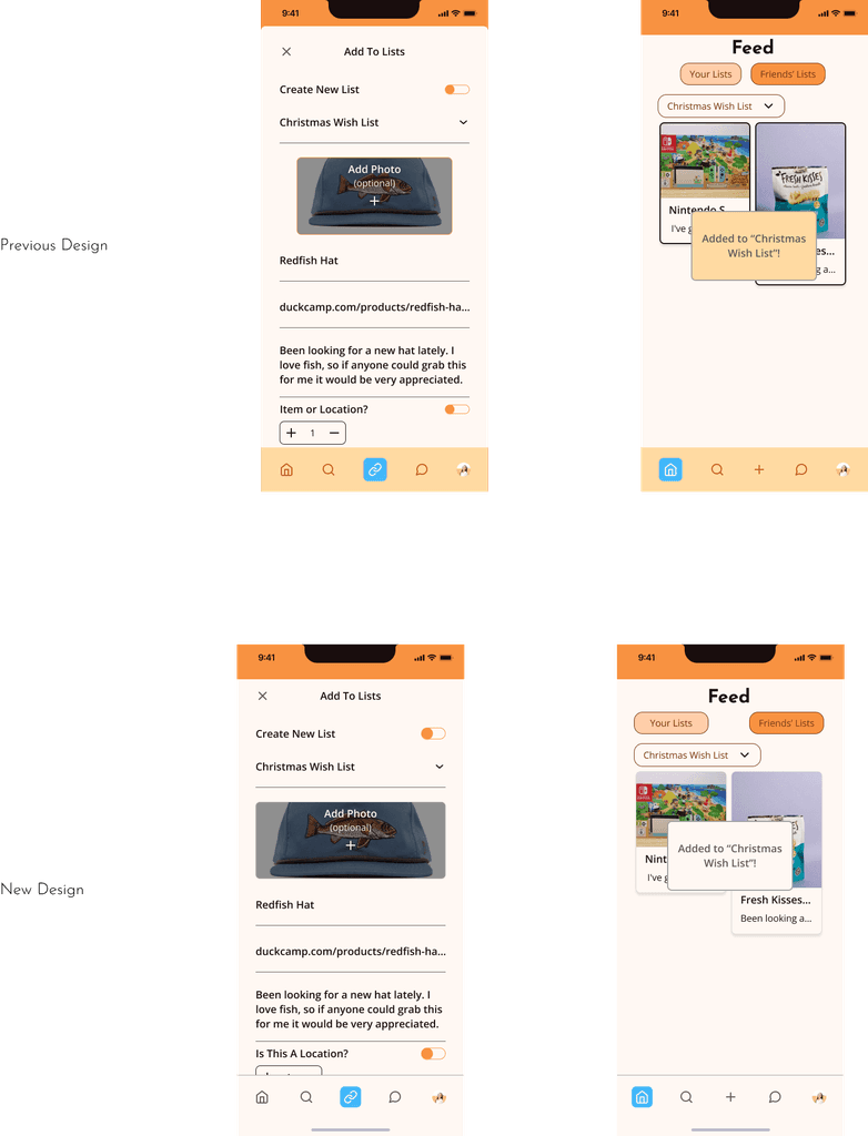
Much of the polishing of Surprise Me! was completed within the high-fidelity phase. I needed to implement a feature that would differentiate items from locations in wish lists, so users could add additional information if needed.
Users would be able to toggle whether a wish list item was a place or not, and depending on if the toggle was on or off it would show a text field for an address or a button for item quantity.
Hi-Fidelity Screens
Much of the polishing of Surprise Me! was completed within the high-fidelity phase. I needed to implement a feature that would differentiate items from locations in wish lists, so users could add additional information if needed.
Users would be able to toggle whether a wish list item was a place or not, and depending on if the toggle was on or off it would show a text field for an address or a button for item quantity.
3 - Design 💻
3 - Design 💻
Prototype
To give users a better idea of how Surprise Me is meant to flow, I created a prototype of the 5 main flows below:
Prototype
To give users a better idea of how Surprise Me is meant to flow, I created a prototype of the 5 main flows below:
Iterations
The first iteration for Surprise Me! was the version I did in school, one that unfortunately had forgone many UX best practices I didn’t know to do at the time. I was not checking contrast, or following any convention with buttons and components. For this new round, I knew I wanted to create both a better user experience and a cleaner interface. Taking references from my mood board, I redesigned my app to be more natural to the social media experience by creating standard-sized buttons, text hierarchy with mobile in mind, and improved iconography.
But there was still something missing. I didn’t want Surprise Me! to simply function better; the first iteration certainly got a face lift, but the second was still not as seamless as I was envisioning— so I worked on it again. Improving UX and improving UI often go hand in hand, but for the newest iteration (labeled New Design) I focused on the UI especially. I removed the yellow background of the navigation entirely to make it more seamless with the rest of the app, and drastically minimized the use of the warm yellow color; orange was the primary color anyway, so I wanted to give it the spotlight. Less was indeed more in this case.


Mid-fi Wireframes
My medium-fidelity wireframes gave me the opportunity to really expand on my sketches, and work out more relevent screens. Surprise Me!'s navigation bar and board screens were built with social media in mind - like Pinterest or Instagram - to increase its market familiarity.
Simplicity is also a core aspect of Surprise Me’s! design and extends to keeping users within the app, by letting them search for wishlist items in a browser within the app itself. It also has an in-app chat interface where users can name group chats, and see them all on the sidebar for easy access. Customizing your experience on Surprise Me! further can be done in the profile section.


In The Past
This project was a big challenge for me; not only because it would be my first time designing for AI, but also because working with a team in about 3 different timezones - including a 6 hour difference for the CEO and COS in Switzerland - made consistent communication of the utmost importance. My challenges during this project empowered me to speak up and ask questions to ensure I delivered a high-quality product. Ultimately, compared to the original website, Homnox has become more visually engaging, with an interactive generative AI element and a sleek new design.
Style Guide
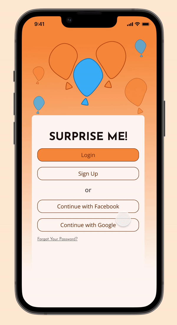
For my primary colors, I used tangerine and white. Orange is associated with energy and cheerfulness, and I wanted to infuse warmth into Surprise Me!-- indicative of the sort of warmth you feel when you're about to do something kind for a friend. A warm tinted white was chosen for more contrast, and to give users' eyes a break from the more saturated orange. Blue became my main accent color as it's a compliment of orange, and is associated with trust. Users should feel comfortable adding whatever they'd like to their boards.
Additionally, I wanted a logo that could bring Surprise Me!'s fun, vibrant energy to the forefront. I designed 3 balloons loosely based on exclamation marks, to really emphasize the spontaneous nature the app encouraged. The full logo was not necessary to display on every page though, so I built variations of the logo for user profiles.
My typography choices were based on what I had recognized from other gift registry apps; the use of sans-serifs. To achieve more contrast, I chose Josefin Sans for its unique curves as my more important headers and inline buttons. Open Sans, in comparison, is very classic and straightforward. I left it for smaller headings and body text.
Style Guide
For my primary colors, I used tangerine and white. Orange is associated with energy and cheerfulness, and I wanted to infuse warmth into Surprise Me!-- indicative of the sort of warmth you feel when you're about to do something kind for a friend. A warm tinted white was chosen for more contrast, and to give users' eyes a break from the more saturated orange. Blue became my main accent color as it's a compliment of orange, and is associated with trust. Users should feel comfortable adding whatever they'd like to their boards.
Additionally, I wanted a logo that could bring Surprise Me!'s fun, vibrant energy to the forefront. I designed 3 balloons loosely based on exclamation marks, to really emphasize the spontaneous nature the app encouraged. The full logo was not necessary to display on every page though, so I built variations of the logo for user profiles.
My typography choices were based on what I had recognized from other gift registry apps; the use of sans-serifs. To achieve more contrast, I chose Josefin Sans for its unique curves as my more important headers and inline buttons. Open Sans, in comparison, is very classic and straightforward. I left it for smaller headings and body text.
Hi-Fidelity Screens
Much of the polishing of Surprise Me! was completed within the high-fidelity phase. I needed to implement a feature that would differentiate items from locations in wish lists, so users could add additional information if needed.
Users would be able to toggle whether a wish list item was a place or not, and depending on if the toggle was on or off it would show a text field for an address or a button for item quantity.


4 - Prototype 📲
Prototype
To give users a better idea of how Surprise Me is meant to flow, I created a prototype of the 5 main flows below:
I Want To Join Surprise Me!

I Want To Add Items To My Wishlist
I Want To Organize A Secret Gift Exchange Event With Friends


I Want To View Items From My Friends’ List
I Want To Be Able To Add Items To My Wishlist Within The App
Style Guide
For my primary colors, I used tangerine and white. Orange is associated with energy and cheerfulness, and I wanted to infuse warmth into Surprise Me!-- indicative of the sort of warmth you feel when you're about to do something kind for a friend. A warm tinted white was chosen for more contrast, and to give users' eyes a break from the more saturated orange. Blue became my main accent color as it's a compliment of orange, and is associated with trust. Users should feel comfortable adding whatever they'd like to their boards.
Additionally, I wanted a logo that could bring Surprise Me!'s fun, vibrant energy to the forefront. I designed 3 balloons loosely based on exclamation marks, to really emphasize the spontaneous nature the app encouraged. The full logo was not necessary to display on every page though, so I built variations of the logo for user profiles.
My typography choices were based on what I had recognized from other gift registry apps; the use of sans-serifs. To achieve more contrast, I chose Josefin Sans for its unique curves as my more important headers and inline buttons. Open Sans, in comparison, is very classic and straightforward. I left it for smaller headings and body text.


5 - Reflection 🪞
5 - Reflection 🪞
5 - Reflection 🪞
4 - Prototype 📲
In The Future
This project was a big challenge for me; not only because it would be my first time designing for AI, but also because working with a team in about 3 different timezones - including a 6 hour difference for the CEO and COS in Switzerland - made consistent communication of the utmost importance. My challenges during this project empowered me to speak up and ask questions to ensure I delivered a high-quality product. Ultimately, compared to the original website, Homnox has become more visually engaging, with an interactive generative AI element and a sleek new design.
In The Past
The main issue with surprise parties is not the parties themselves, but the sentiment behind getting someone a gift they both enjoy and weren't expecting. As this is not exclusive to a party, I had to reevaluate the goal of my project. This is something that was initially disheartening, that I wasn’t going in the right direction; but when you are trying to create the ideal user experience, the users will always be your greatest resource— it was completely natural and positive in the end that I followed what the data was saying and made a pivot. I’m aware now that this is common in many projects even, and products are made better for it.
In The Future
The next steps would be to test this current iteration. Because of the time constraints of my class, I wasn't able to do it during that semester, but if I were to find the time now I would ideally want those surveyed to test for me. There are already some features I anticipate needing for a future iteration too, like a way to notify other friends - not the potential recipient - that someone has saved a wishlist item, so no one gets duplicates of a gift unless they specify wanting that.
Lizzy Olubisi Olu-Talabi
Lizzy Olubisi Olu-Talabi